
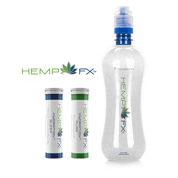
Hemp FX
Planting a new product line in a fast-growing industry.
Branding • Campaign • Packaging • Print • Social • Video • Web
Hemp FX was launched as an exciting, new line of health products that combine organically grown, hemp-derived cannabinoid oil, with proprietary blends of nutrients. These products target specific health-related issues and are developed using a novel extraction and infusion method.
LEVEL
Corporate
PROJECT
New product line
ROLE
Creative Director / Art Director
– As part of the in-house marketing team at Youngevity, a health products and services company, I directed the branding, packaging and collateral for the new product line and co-directed the launch.
CHALLENGE → SOLUTION → APPROACH → RESULT
THE CHALLENGE
The goal was to launch not only a new product line, but an entirely new vertical for the company – and this wasn’t just any vertical. This was the rebel category that had become a full-fledged, multibillion-dollar industry known as CBD (hemp), with plenty of players already in the game.
In addition, the line was slated to sell as a high-end, high-tech brand, due to the proprietary technology and associated costs. Despite that, it also needed to retain a natural, earthy feel because let’s face it, everything starts with a plant. These were competing branding styles to say the least.
A fun bonus challenge, was the inescapable fact that although the category was well established, its stigma remained. The average person still associated hemp and CBD with its happier sister THC, the compound most notably found in marijuana.
THE SOLUTION
Luckily, our products were novel, much higher quality than most and we controlled the entire process – this theme became our general brand positioning.
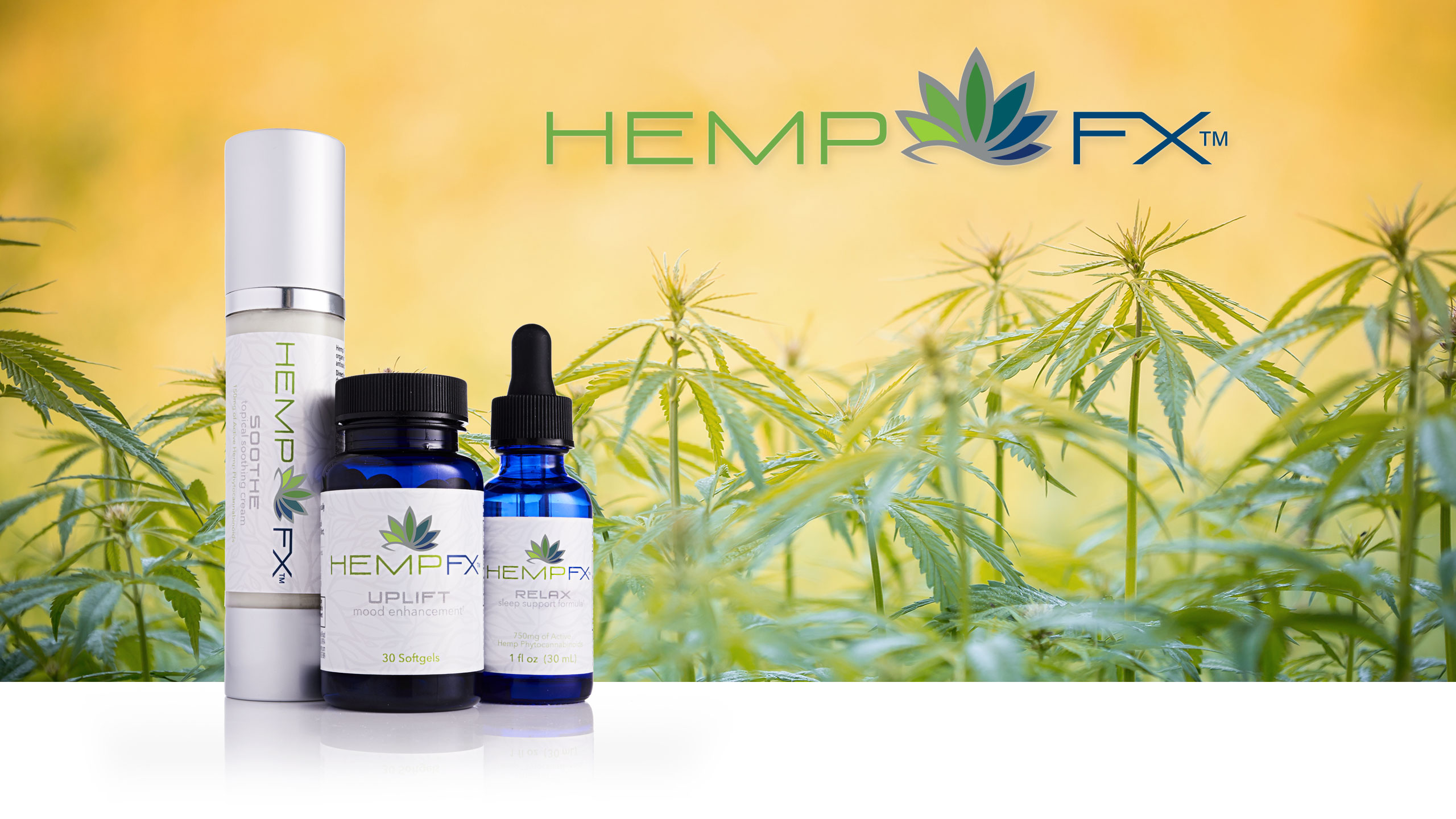
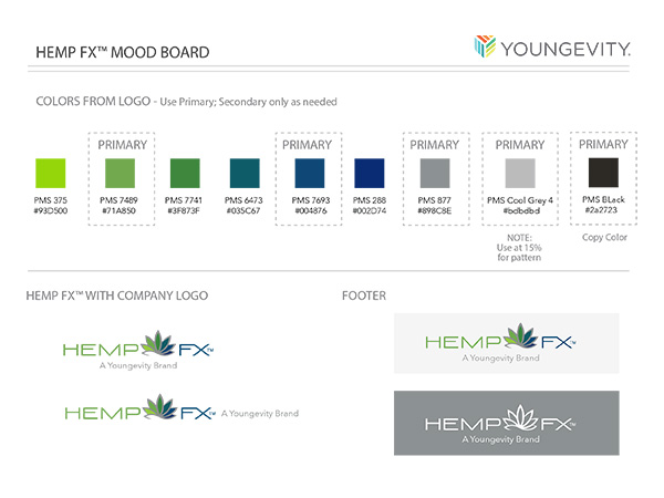
The name and logo had to clearly state what the product was (hemp), to immediately differentiate it from its better known sibling, THC – “Hemp FX” was born.
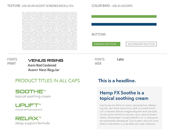
A tall, sleek, silver airless pump and premium blue glass bottles provided a perfect presentation for these products – they paired well with the logo colors and background.
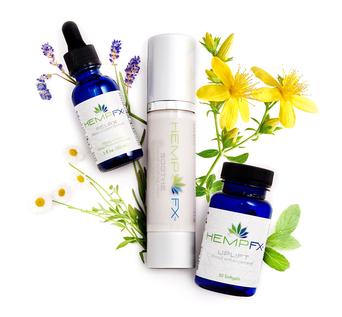
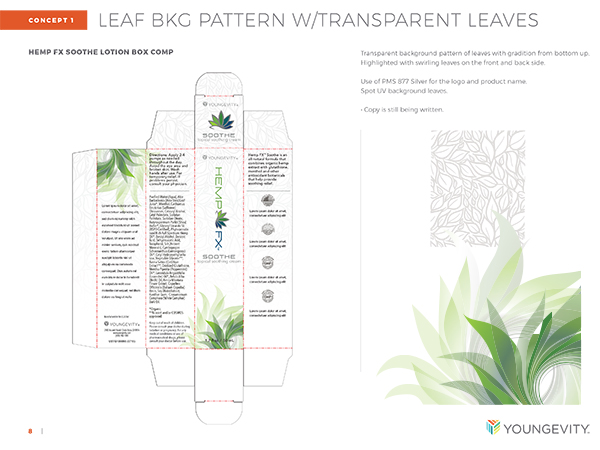
Fine details like a touch of foil and silver banding were added to enhance the packaging aesthetic. A subtle background pattern of stylized leaves was used to add a natural feel.

We needed to blanket the airwaves and get the word out in every available channel.
In parallel to the product packaging, the massive undertaking for the launch campaigns and communications was happening. It was crucial to emphasize that our products were indeed different and the quality was significantly better. We had even acquired a company just to have our own extraction lab, enabling oversight into all points of quality control.
This meant producing content, customer education and lots more content. We needed to blanket the airwaves and get the word out in every available channel.
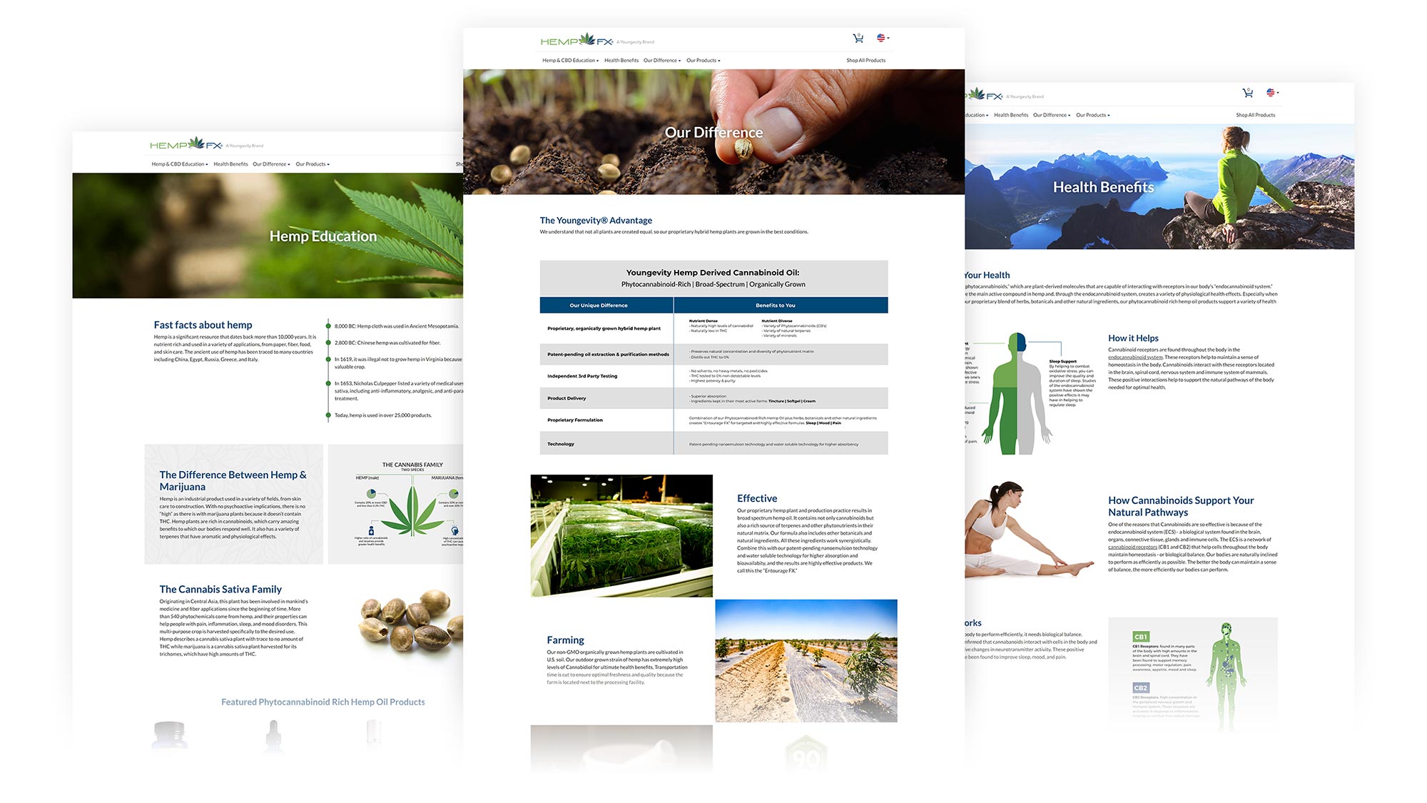
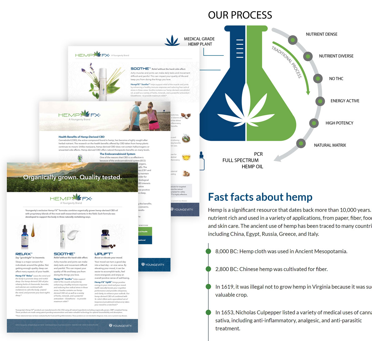
It was an intense team effort to create the extensive amount of marketing media needed in all the various formats. Some of this included a standalone website, featured landing page on the company website, brochures and print materials, infographics, educational videos, email and social media campaigns, press releases, online product catalogs, corporate magazine features and more.

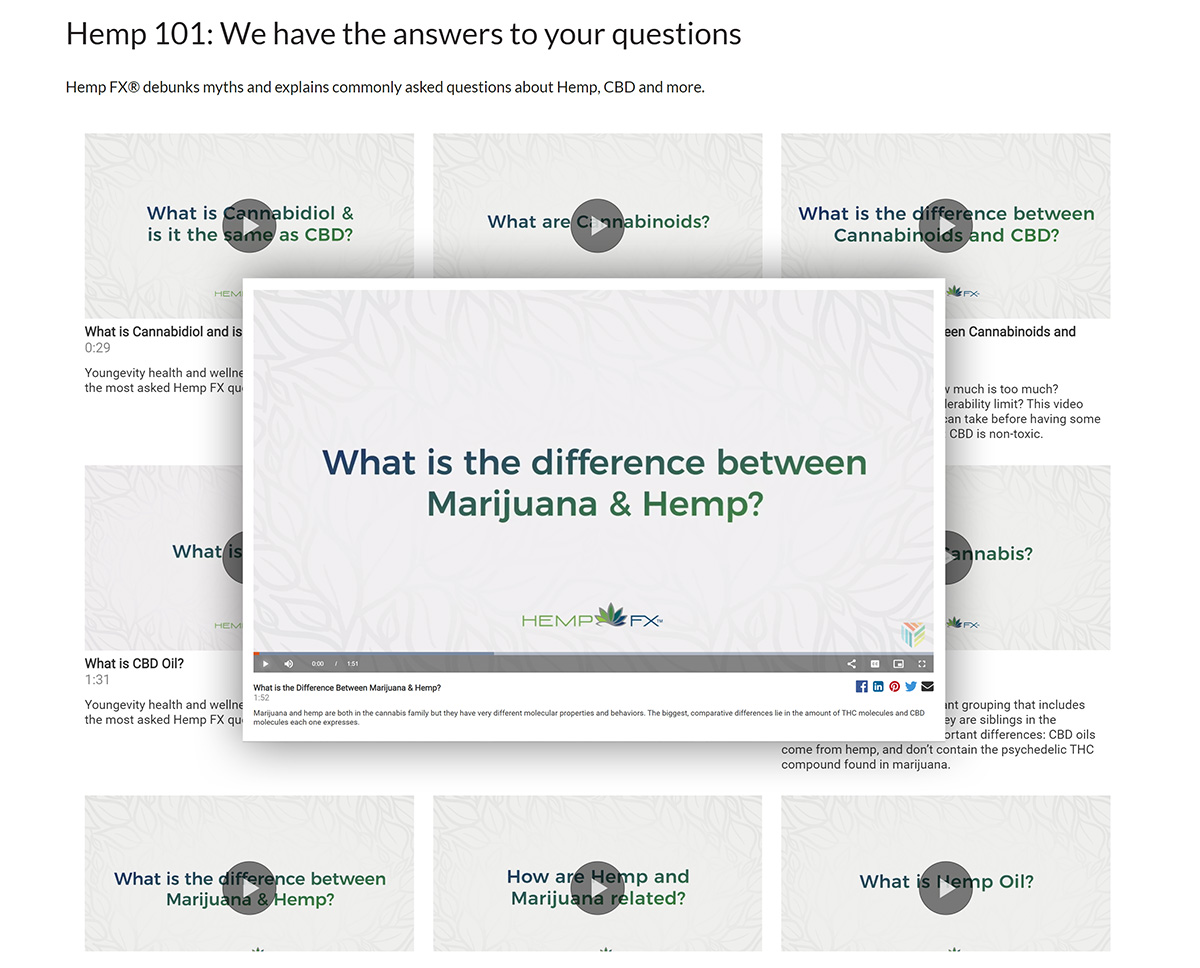
Educational Videos
Product Info &
Hemp Education
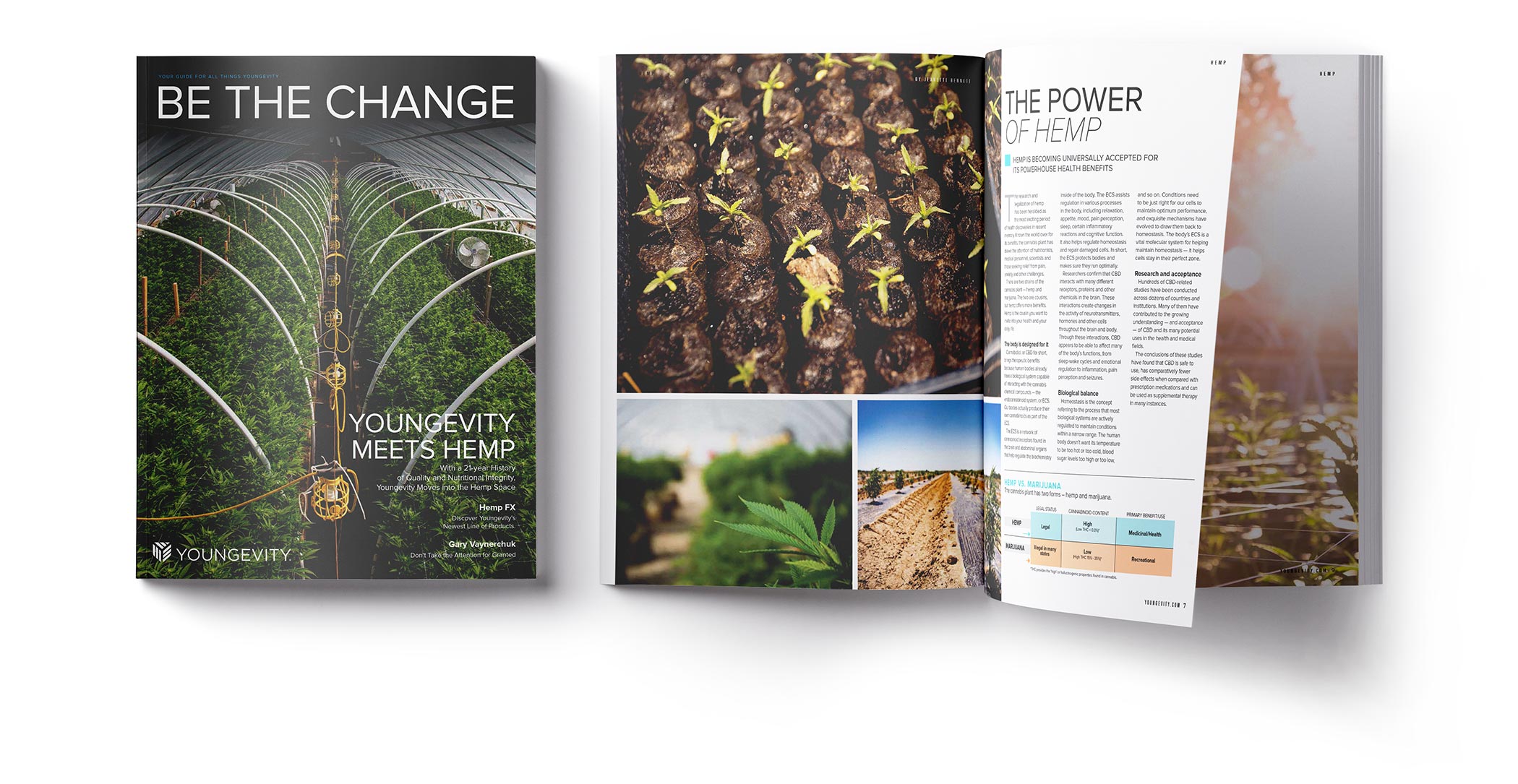
Magazine Feature
This is a preview, the full feature was 6 pages.
Social Media


THE APPROACH
For each new product launched, we start by answering our three “golden questions” – who’s it for, what does it do, and what makes it different. This simple phrasing, rather than traditional marketing terminology, helps the team more easily manage the content. Through the process of answering these questions, we form the foundation for the brand.
The name. A million emails with never-ending name ideas, which each had to be checked for trademark availability (kudos to our lawyer, Tyler, for hanging with us). Was email the best method? Probably not, but sometimes it’s the only way to reach the top decision-makers.
Mood boards and a concept deck (the final was v5) were co-created, along with numerous logo options and packaging drafts.
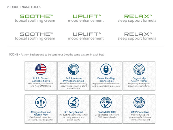
We had originally included some great looking design elements on the packaging, but I ultimately decided against using them – they were just too much with the established background pattern.

The regulatory review process played a major role in this project particularly, due to the nature of the industry we were jumping in to. Always fun to receive marked up documents.
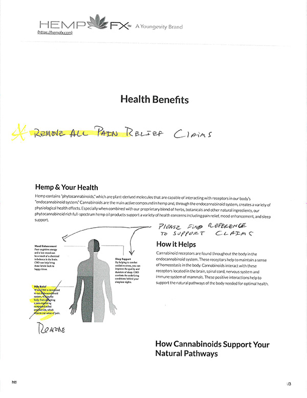

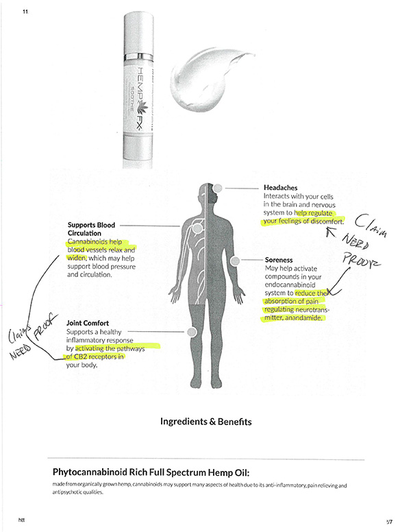
An interesting side story, was the content usage of the phrase “full spectrum“, which basically just refers to the purity of the CBD produced in the extraction process. But it’s a federally regulated term and had to be used correctly. So, with some help from our regulatory department, we all became experts on usage and proceeded to apply it to literally everything we created – hundreds of files and media types.
And then came the email that nearly killed a few of us…
But after a few deep breaths, a team Happy Hour, and an assurance from leadership that after the web updates we had a longer timeframe – and we were ready for this new challenge too.
THE RESULT
The Hemp FX line was ultimately given the green light, but initially, only a limited quantity was made available for presale – it quickly sold out.
The three new products were a hit and had launched with fantastic customer reception. People loved the high-quality formulas and their results.
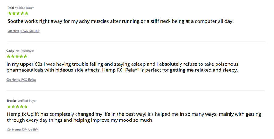
One product (Soothe) even made a “Best of CBD Skincare” list by Swirled, which is kind of amazing considering how many CBD products are out there.
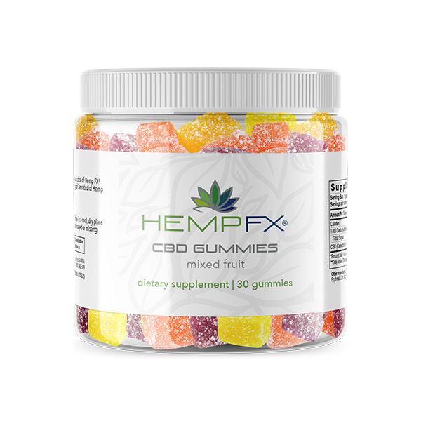
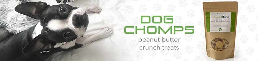
To further capitalize on the brand’s success, we expanded the line into some of our other categories with products including CBD gummies, coffee, dog treats, pet chews and hydration tablets. These new products, along with supporting social content, all helped to reinforce the Hemp FX brand and contributed to increased sales.
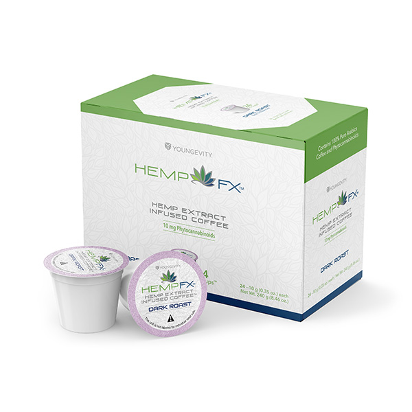


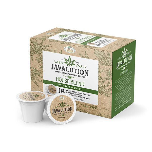
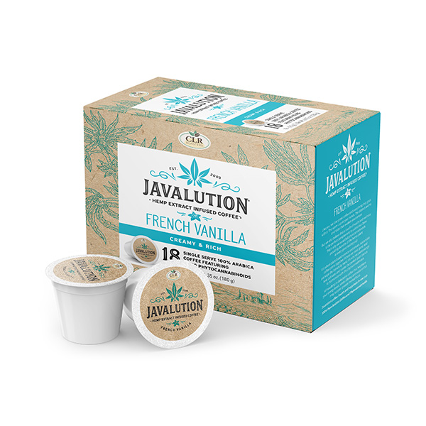
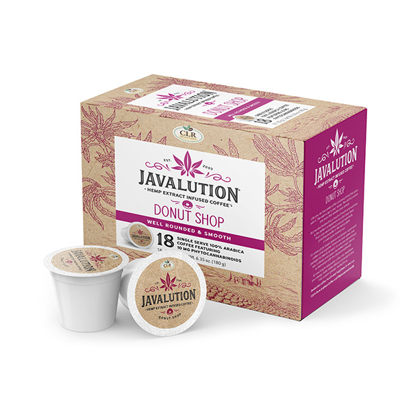
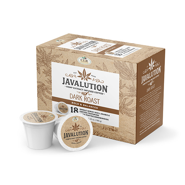
We also launched a full sub-brand, Javalution Hemp Coffee, under our subsidiary company, using the same infusion technology. Sales of this line were also strong, including on Amazon, and “helped drive 54% revenue increase to Save Mart Supermarkets“, who carried it in over 500 of their stores.
After the Hemp FX initial launch and campaign, sales leveled off as expected, but remained stable and consistent. All of the products are still currently available.
Note: Detailed sales statistics are withheld to comply with non-disclosure agreements.
FINAL THOUGHTS
Overall, this project went pretty well considering the enormity of it. I’m always looking to improve and streamline processes, especially when there’s this many moving pieces – the areas that are lacking them really show. And sure, there were definitely bumps in the very windy road, but the team pulled together when it mattered most and that’s what counts.
THE TEAM
CREATIVE DIRECTOR
Sean Walker
BRAND DIRECTOR
Corinne Skoog
ART DIRECTORS
Sean Walker, Carey Gansert
DESIGNERS
Carey Gansert, Maile Soon,
Ursina Kilburn, Janet Ramler
COPYWRITERS
Rocio Ramos, Chris Mays
PHOTOGRAPHER
Jason Guffy
WEB TEAM
Brian Posalski, Ryan Takahashi,
Juito Hartanto, Lizette Payneward
SOCIAL MEDIA
Paola Martinez
VIDEO
Scott Salik
PROJECT MANAGERS
Ethan Shurson, Aliyah Hassan
REGULATORY
Bradley Strout
LEGAL
Tyler Hicks