
WinFit
Shaping the future of fitness with an innovative system.
Animation • Branding • Campaign • Print • Social • Video • Web

WinFit was launched as a revolutionary body shaping system with a new approach to healthy weight loss. It didn’t focus on diet and calories, but instead guided customers on using a combination of the company’s current proprietary health products, simple exercise and lifestyle changes, to achieve results.
LEVEL
Corporate
PROJECT
New health system
ROLE
Creative Director / Art Director
– During my time at LifeWave, a health technology company, I directed the strategy, branding and marketing collateral for the new system, working in tandem with in-house designers and external agencies.
CHALLENGE → SOLUTION → APPROACH → RESULT
THE CHALLENGE
The goal of the system was to utilize mostly existing company products and build a complete step-by-step guide for customers to follow on their way to better health.
This was a one-of-a-kind opportunity to introduce a wellness system capable of changing lives. Concentrating our efforts on three key success factors was necessary to maximize launch impact.
- Creating energy and excitement
- Building rapid momentum
- Segmenting for results
THE SOLUTION
The system had the potential to transform people’s lives through better health that customers would be excited to share. We wanted to leverage that excitement with branding, positioning and messaging that was impactful, meaningful and intriguing, to encourage conversation and community-building.
WinFit offers a simple, powerful method to rapidly burn fat and build a leaner, stronger body. By taking a holistic approach to health that incorporates new technology, proven science and sensible nutrition, you can reset your body to function the way it was naturally intended.
It’s a lifestyle change that will have you looking and feeling your best every day.
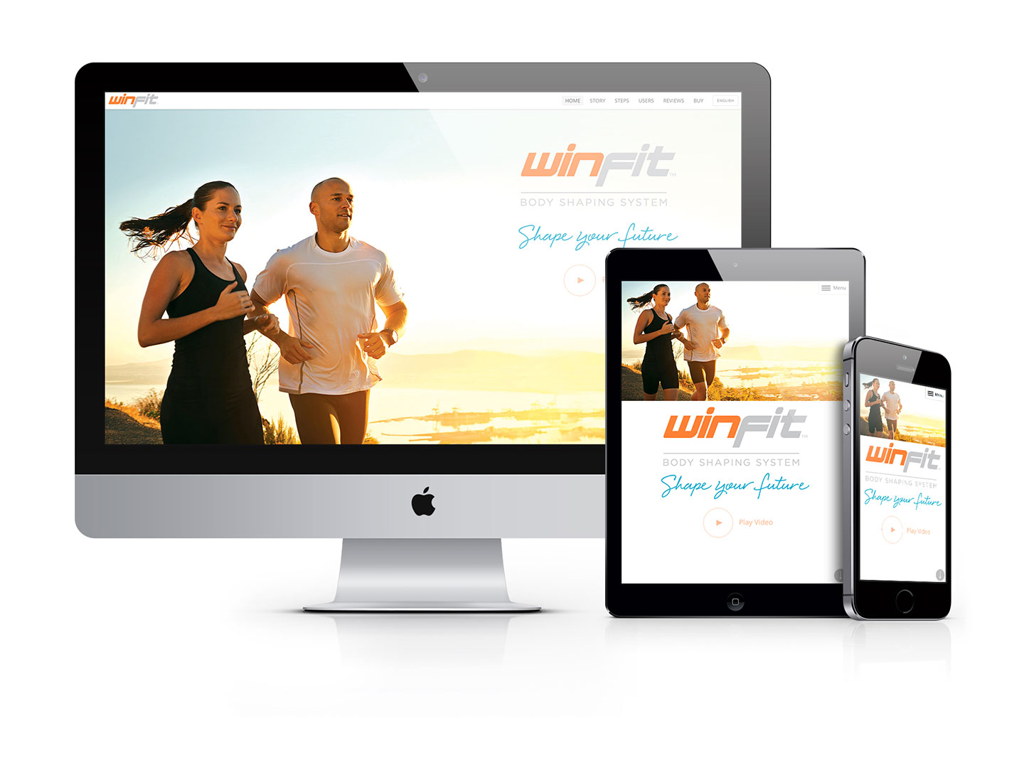
To create anticipation, I worked closely with an outside animator and voice actor to produce a teaser video. The budget didn’t allow for a video shoot, so stock footage was used minimally, allowing the custom animation to do the heavy lifting. This presented customers with an initial basis of the story and a hint at what they could expect from the new system.
You only have one chance to make a good first impression, which is especially true with a system that could easily overwhelm the customer. So we developed product tools that leveraged each other, allowing the system to be self-guided, easy to understand, embrace and share.
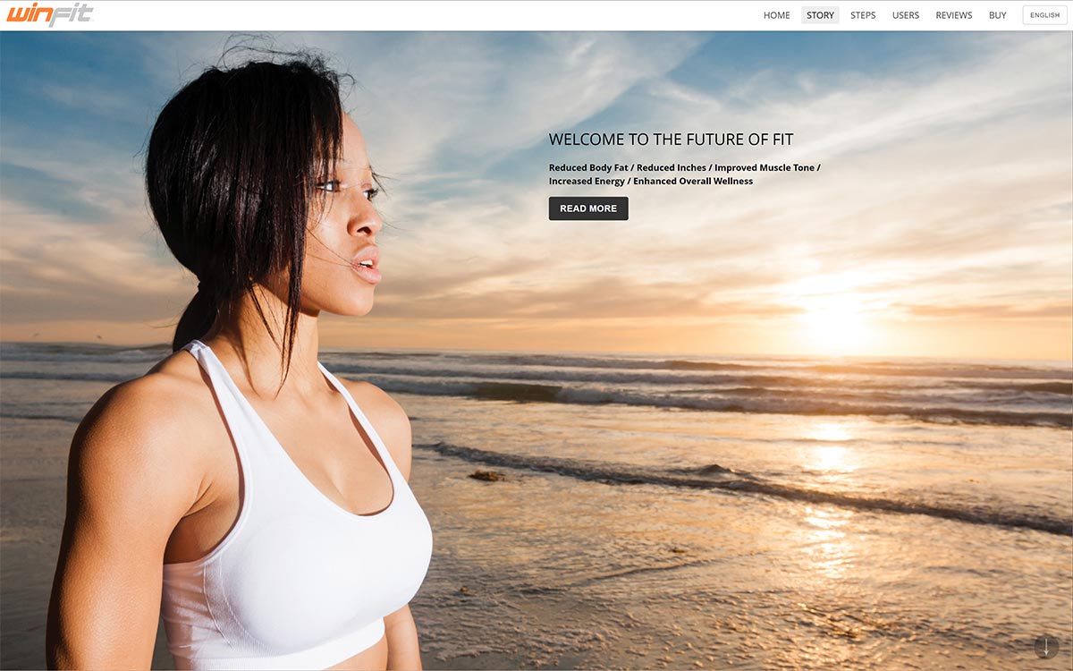
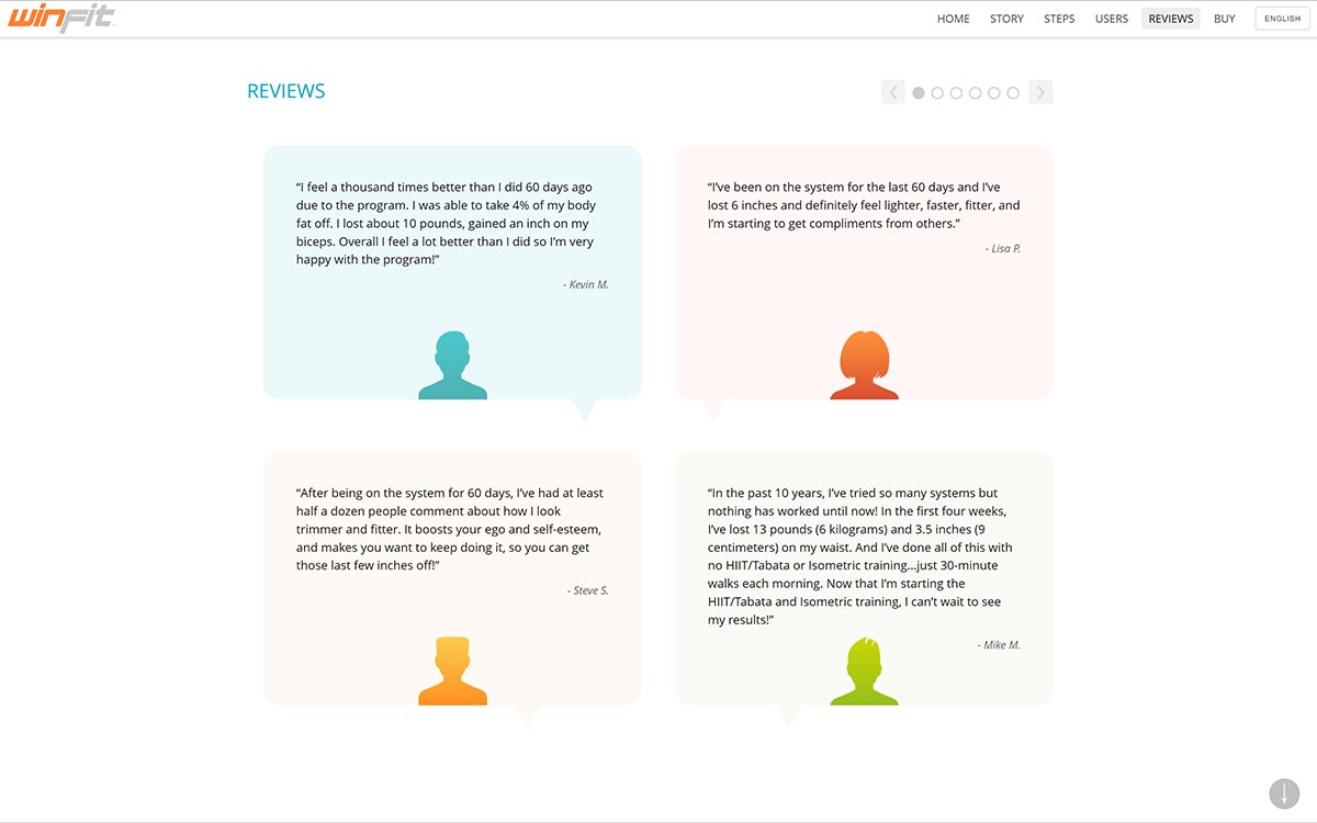
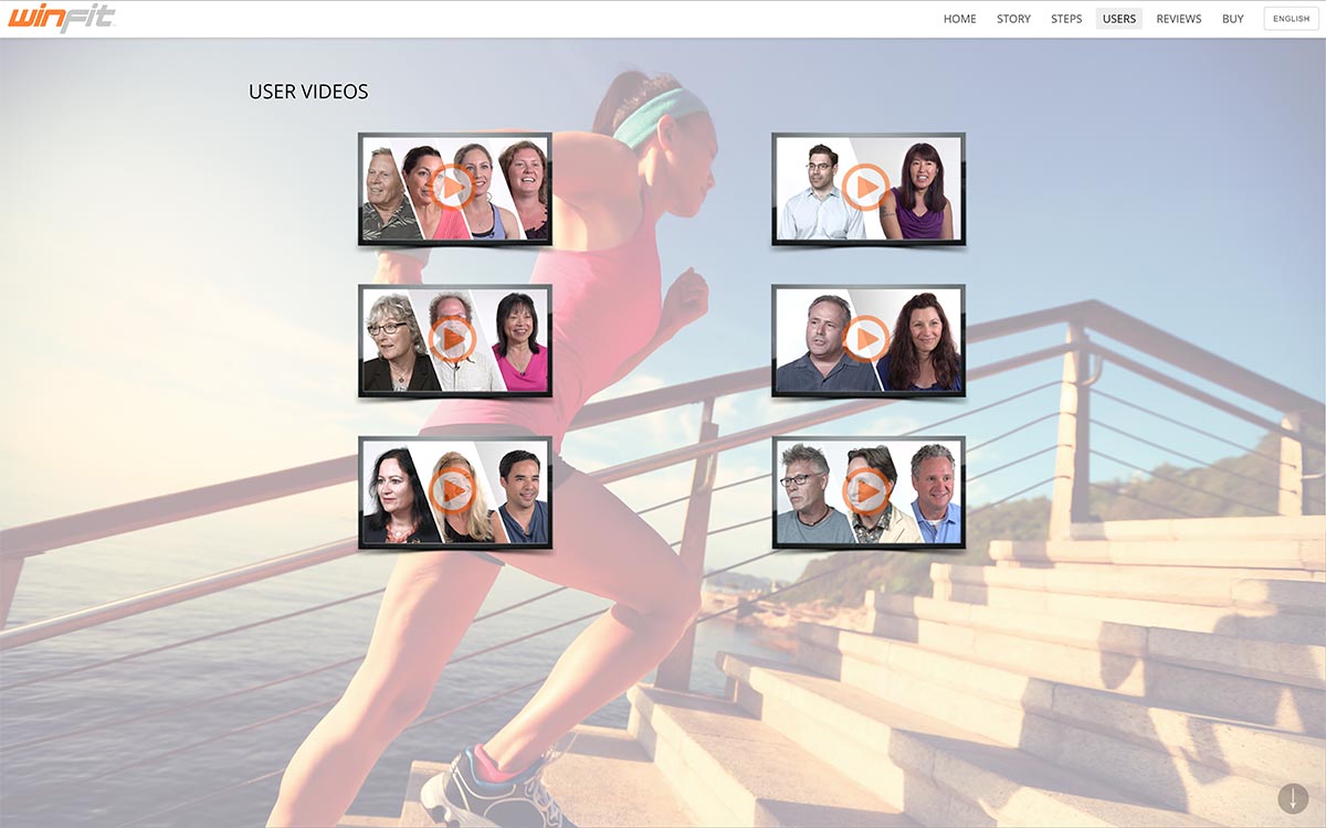
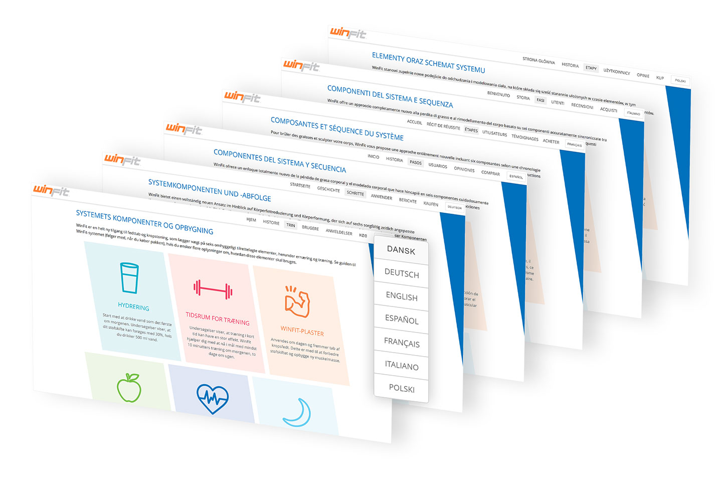
Overseeing a collaboration between our internal web team and an external agency, enabled the creation of a separate microsite with “scenes” that told a story and led the user to take decisive action. This helped to attract new customers to the system and keep them engaged. Equally as important, it included a private login area that contained extra materials for current customers who had purchased the WinFit system. To support our multiple global markets, the site was expertly translated into 6 different languages.

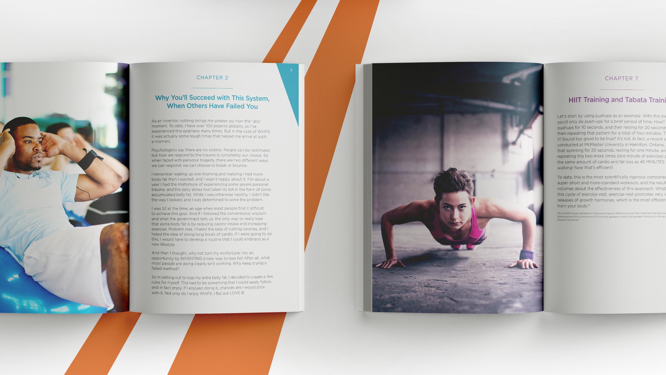
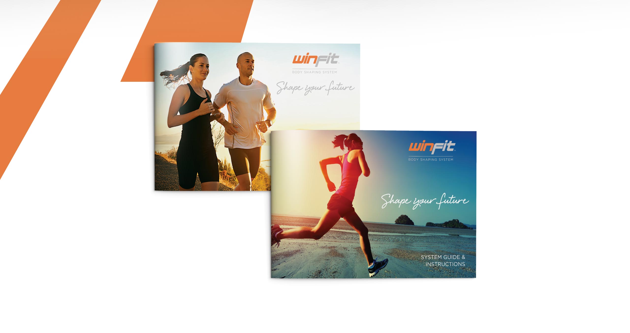
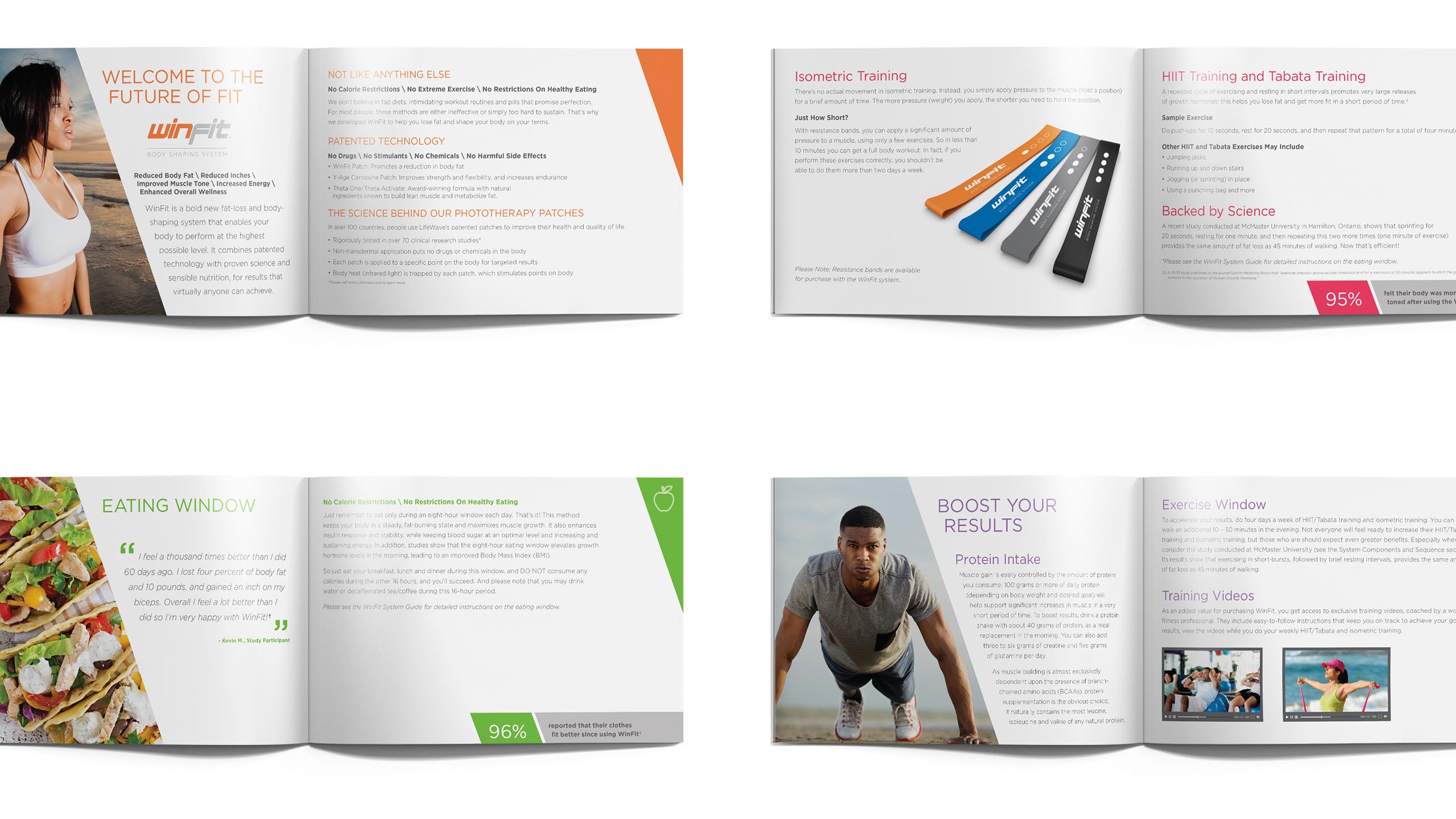
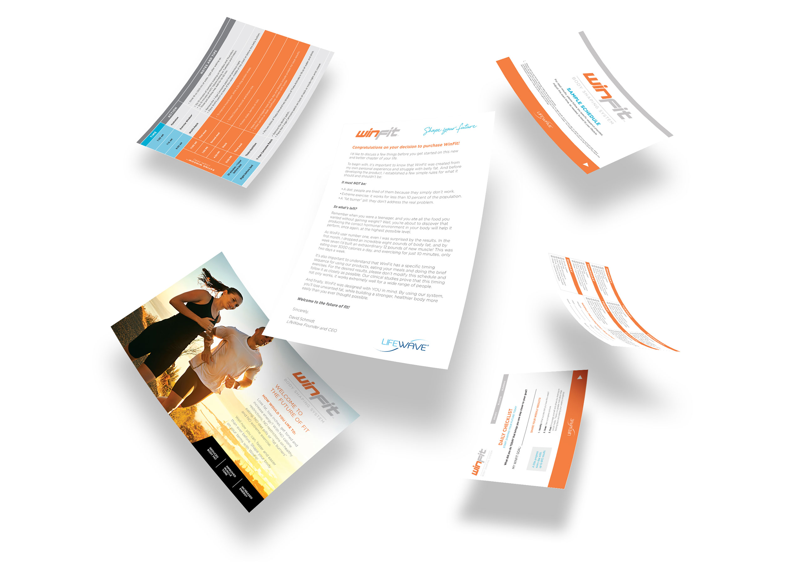
I also worked with our in-house designers in creating the plethora of print collateral needed for the system. Some of this included a book with the WinFit story and detailed product information, an introductory booklet, a complete system guide, daily checklist card, sample schedule, welcome letter and various promotional and campaign materials.

Once the system launched, we blitzed our social channels with energetic, colorful, product-based information, motivation, guidance, goals and healthy lifestyle tips. The audience was fully engaged – people loved the graphics and they were widely shared.


THE APPROACH
Initial logo drafts and support materials were developed, and all concepts were tested using two separate focus groups who provided an extensive amount of valuable data and insights. Many of these were directly incorporated into the marketing and materials.

The logo was important to get right. It had to be friendly and approachable, but strong and energetic. We created various options that circled around the idea of using the lowercase “i” to represent a person.
The focus groups unanimously vetoed that concept for the slanted option, which they liked more because it showed “movement.” We wholeheartedly agreed with them, and in addition to shifting the color to a deeper orange, that became the final logo for the system.
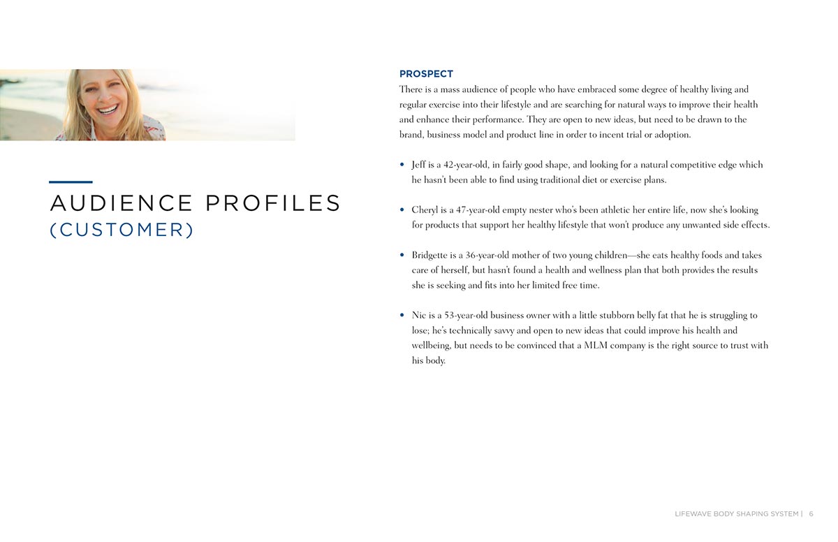
I also worked with an outside agency and we created customer profiles, based on market research, to highlight the ideal target audiences to focus on. These were presented to executives to enforce the brand direction.

THE RESULT
WinFit was a standout winner when it launched, selling out so fast it was temporarily put on backorder. The system went on to enjoy continued success, inspiring customers from all over the world to share their stories about how it changed their health for the better.
Unfortunately, the company later discontinued one of the key products used in the system due to manufacturing complications, which ultimately forced the system to be discontinued as well. But during its time, the company saw dramatic social growth as well as high conversion rates, much of which was directly related to users sharing positive results from WinFit.
Top Seller
Of products in the company
12%+
Social growth per month
18%+
Conversion Rate
Note: Detailed sales statistics are withheld to comply with non-disclosure agreements.
THE TEAM
CREATIVE DIRECTOR
Sean Walker
ART DIRECTOR
Sean Walker
DESIGNERS
Chris Naples, Kira Sjoberg
WEB TEAM
Misha Osinovskiy, Jack Der
COPYWRITER
Chris Mays
SOCIAL MEDIA
Bree Colavin
PROJECT MANAGER
Melissa Mielcarz
OUTSIDE AGENCIES + VENDORS
Names withheld due to NDAs