
Liquid Vitamins
Pouring fresh ideas into a vitamin sea of liquid supplements.
Branding • Packaging • Social
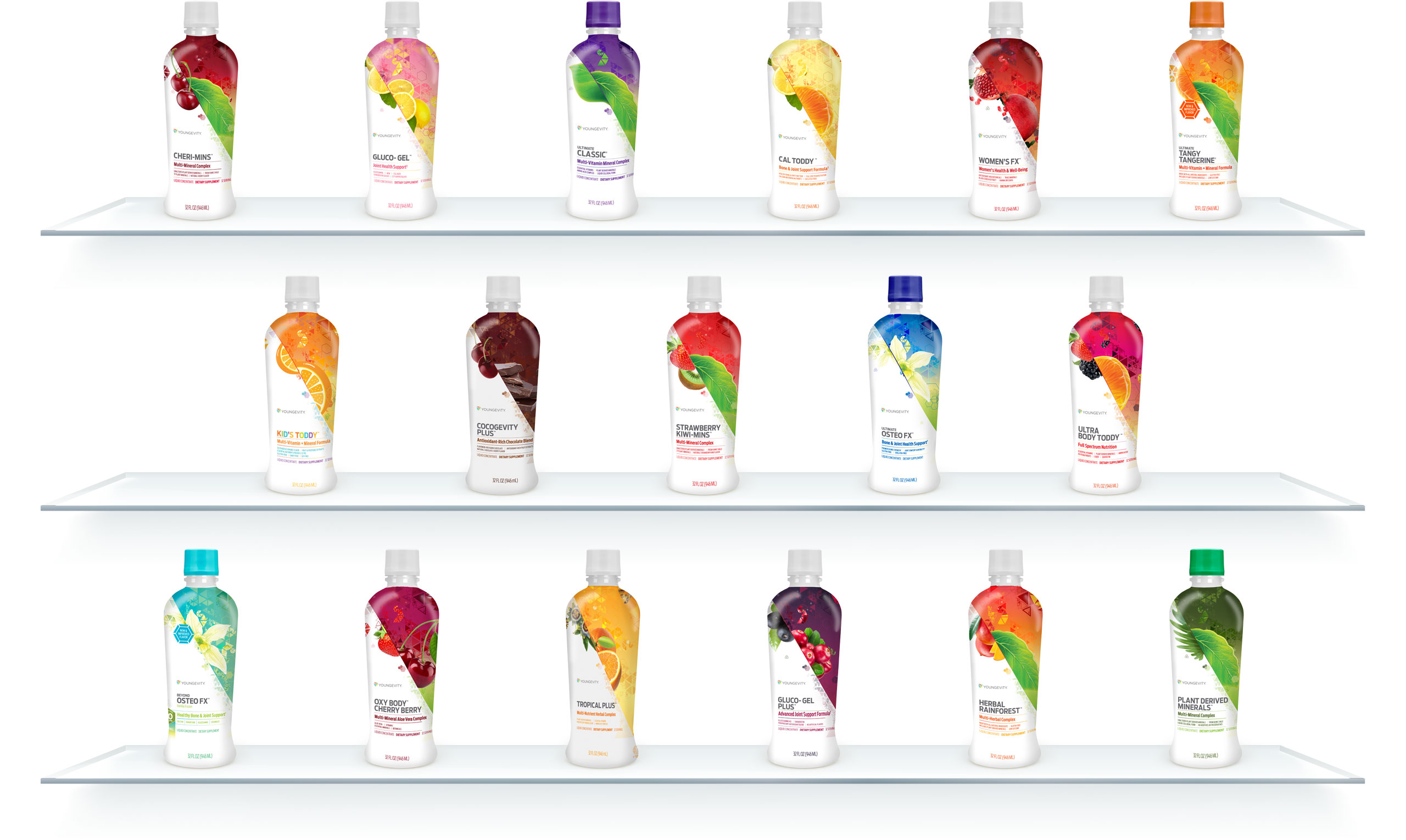
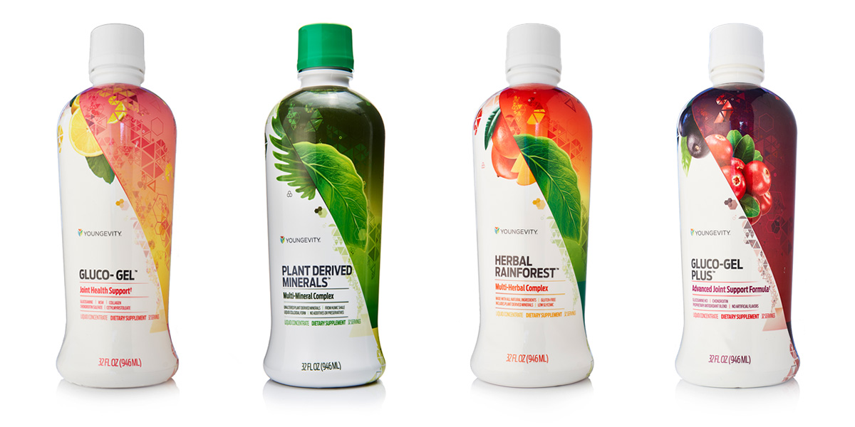
Liquid vitamins are the category for an extensive line of concentrated supplements. These products maximize the absorption of essential vitamins, minerals and nutrients in the body, producing a wide range of health benefits. The branding was revitalized for the entire line of 17 products.
LEVEL
Corporate
PROJECT
Product line rebrand
ROLE
Creative Director / Art Director / Designer
– As part of the in-house marketing team at Youngevity, a health products and services company, I directed the rebranding and packaging for the product line.
PROBLEM → SOLUTION → APPROACH → RESULT
THE PROBLEM
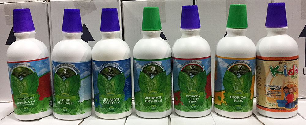
The current packaging for the ever-expanding, large product line of liquid vitamin supplements was outdated and overly repetitive. It was difficult to distinguish one product from another, which was an issue not only for the customer, but our warehouse team as well.
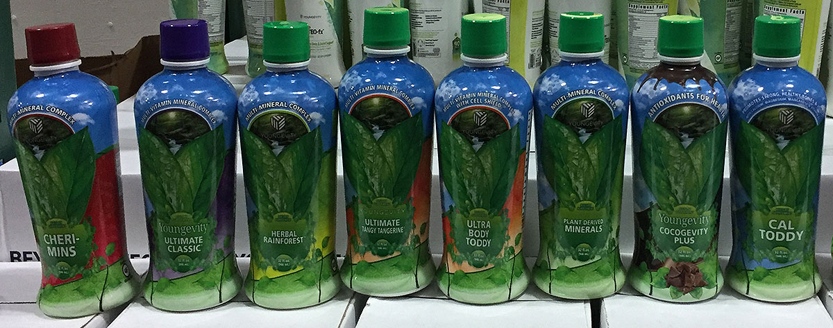
Some of the products still used the very old, original bottles.
There were 17 products with unique benefits, eagerly awaiting a refreshed design, with more in the pipeline. The new branding had to keep all products looking like part of the same family, yet be flexible enough that it could easily be applied to future products as they were added to the line.
Also, current customers knew these products well, due to their very specific formulas. Although the old branding wasn’t winning any design awards, the new branding had to instill confidence that the formulas hadn’t changed, even with the new look.
THE SOLUTION
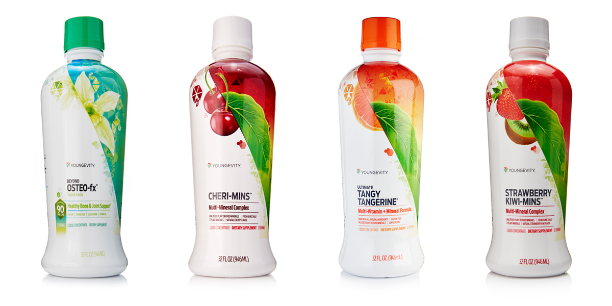
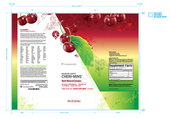
Rebrand using a new design system. Standardized, consistent layouts combined with unique elements that could be swapped out based on product traits. Not a totally new idea in branding, but we had so many products, keeping each one differentiated from the others was the real trick.
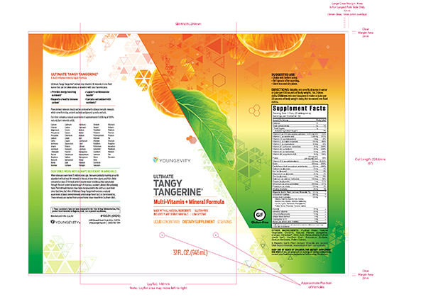
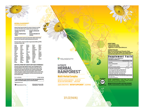
We couldn’t solely use colors to distinguish them, there were too many products and some would overlap. So in addition to colors, the flavor profiles were used to add large graphic elements like fruit.
But in many more cases, for regulatory reasons, there was no flavor called out. In those instances, we still used large graphics, but they were based on specific ingredients found in the nutrition panels rather than a flavor.
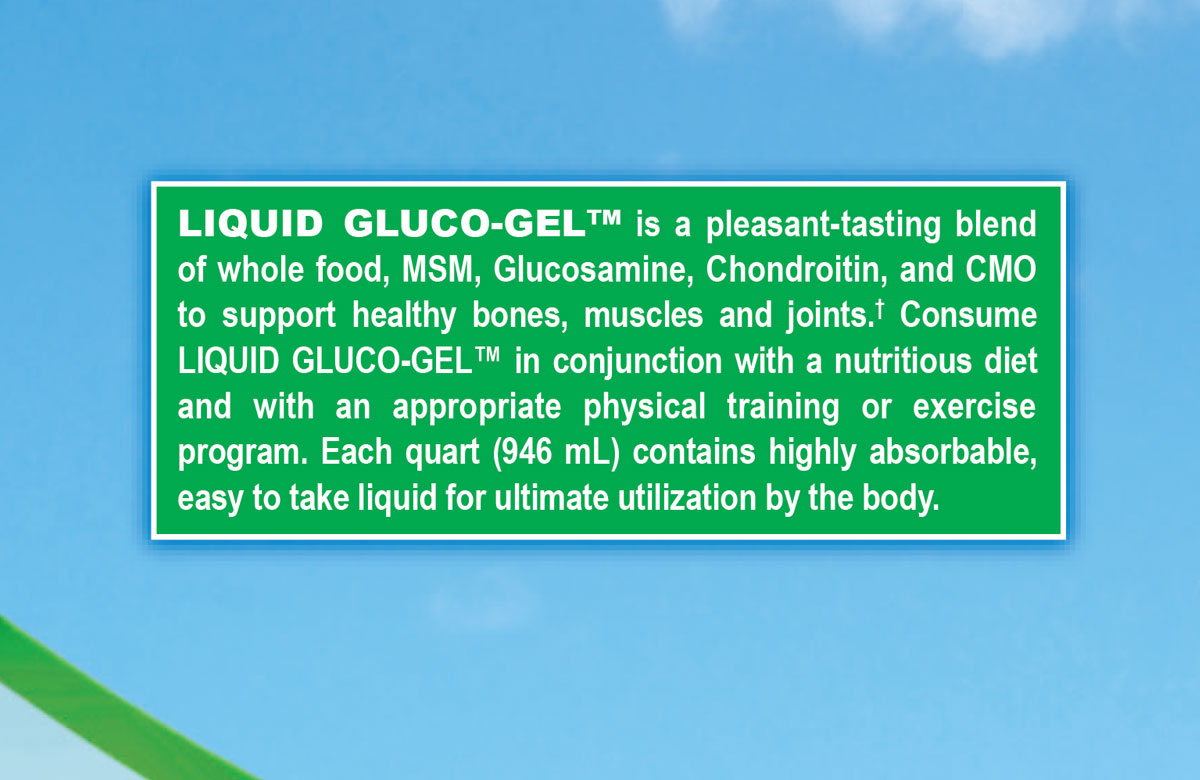
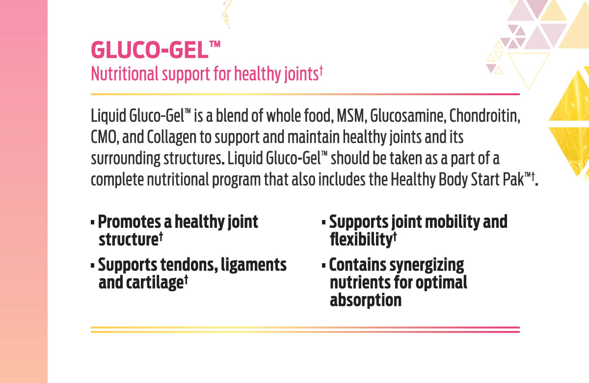
To help transition the customer to the new look, without scaring them that we had changed the formula, most of the descriptive copy was left untouched. Only minor edits were made, as well as adding the product benefits, and of course redesigning.
Solving the inconsistent bottles issue was relatively easy. It just took someone to specifically bring it to attention in our sea of over 2,000 other products. So, I coordinated with the purchasing department before each order, to ensure only the newer bottle type, with corresponding shrink sleeve, would be used.
As each rebranded product was introduced, we gave it a little push on social media, usually cross-promoting with another product. There was no official launch, more on that in the Results section.
We had to tread lightly though – the concentrated supplements last a long time, so many customers still had the old look and would file complaints that they received the wrong product.


THE APPROACH
Once we had a system, the products with simple flavor profiles were straightforward to design.
But there were of course, the outliers who refused to be branded without going through multiple drafts to find a look that somehow corresponded to the product.


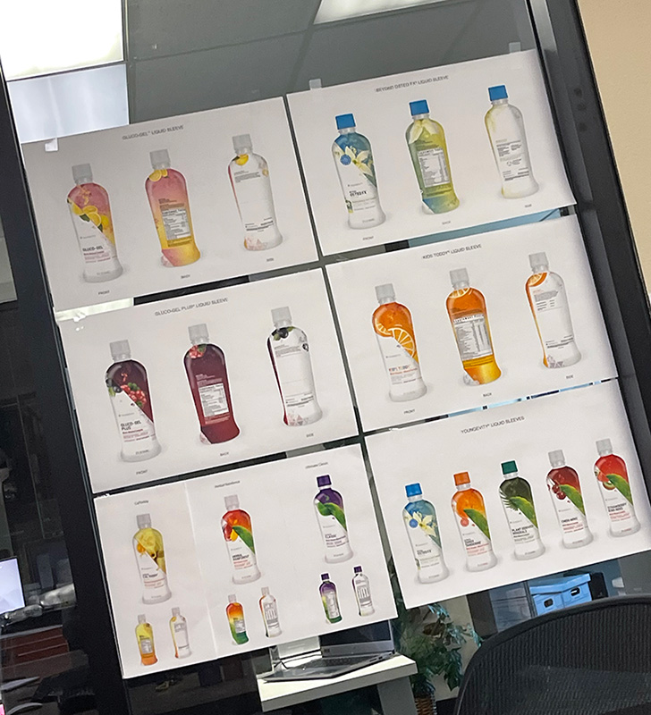
To help keep track of the rebrand progress, we kept a cluster of printouts taped to the internal office window.
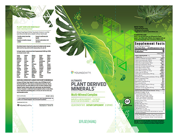
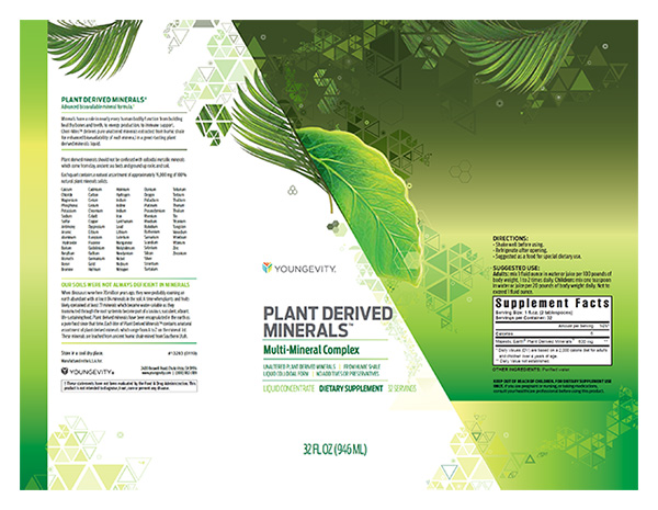
One particular design challenge among the group was the Plant Derived Minerals product. The story behind this one is that it contains minerals from plants in their unaltered form. Is it healthy? Undoubtedly. But the flavor is somewhere between chalk and liquid dirt. No joke. I tried it many times hoping for a different outcome.
Taste aside, the design had to portray it in the best light possible, whatever that was. So concepts were done with the prettiest “dirt look” we could muster up.
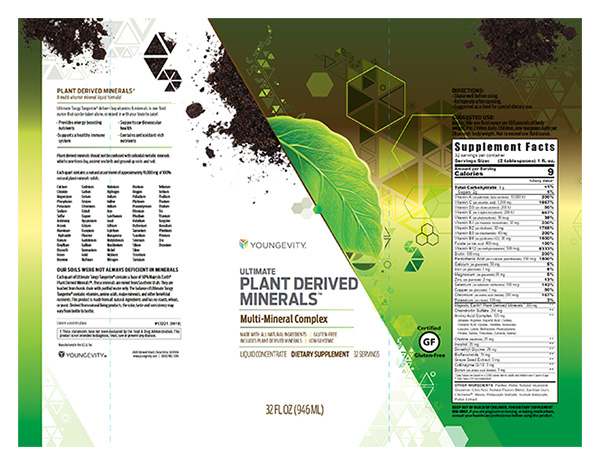
It wasn’t working – nobody was going to drink that unless we promised the fountain of youth. A new approach was needed, so we had to keep the creative juices flowing. We ditched the dirt and focused on the plant types only, which at least looked somewhere in the realm of an exotic salad.
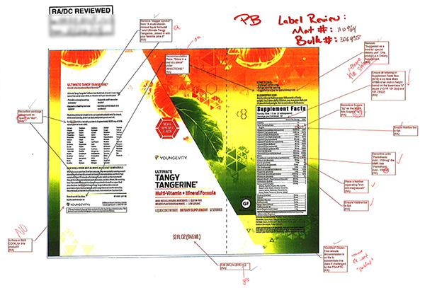
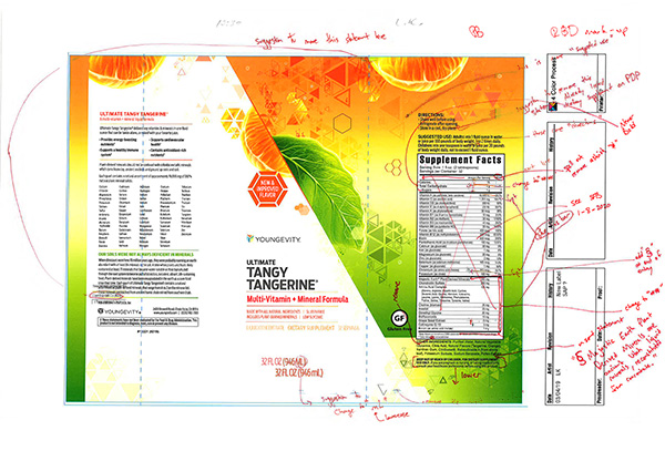
Since these products are concentrated vitamin supplements, there were also detailed regulatory reviews needed for all packaging, before we could even think about going to print.
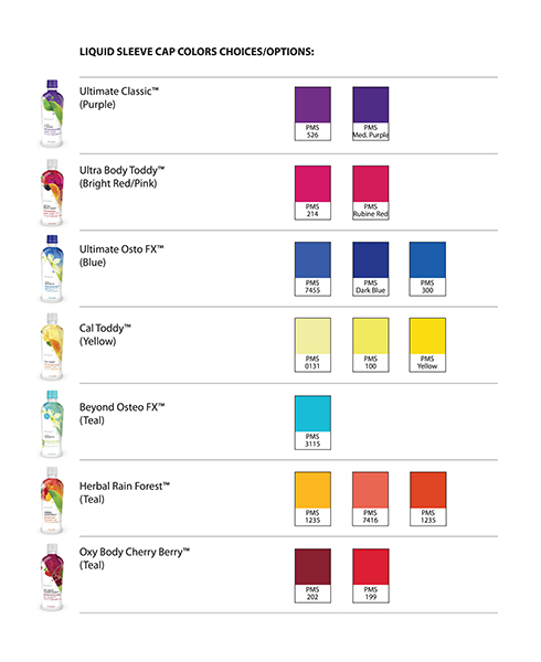
We even matched cap colors to the design colors of the products, which was a fairly tedious process, but helped further differentiate between them.
THE RESULT
There was no official launch or major campaign for these rebranded products. Each new look gets phased in separately, based on inventory levels, which can be months apart, yet we usually don’t know until the last minute (story for another time). Some the products are actually still waiting to be implemented!
Despite the lack of a full launch, sales increased a bit when a new look was updated on the website and promoted on social. There was also a much lower return rate for the reason, “I accidentally ordered the wrong product”.
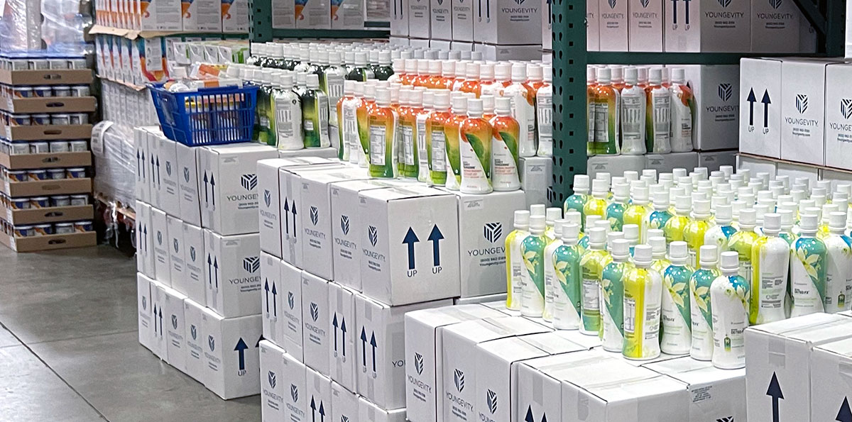
The biggest surprise, was the level of positive impact on our warehouse team. Their speed and accuracy for these orders increased, as they could now easily tell the products apart using the bright colors, different caps and larger product names.
THE TEAM
CREATIVE DIRECTOR
Sean Walker
ART DIRECTORS
Sean Walker, Carey Gansert
DESIGNERS
Carey Gansert, Sean Walker
COPYWRITER
Rocio Ramos
SOCIAL MEDIA
Paola Martinez
PHOTOGRAPHER
Jason Guffy
PROJECT MANAGER
Ethan Shurson