
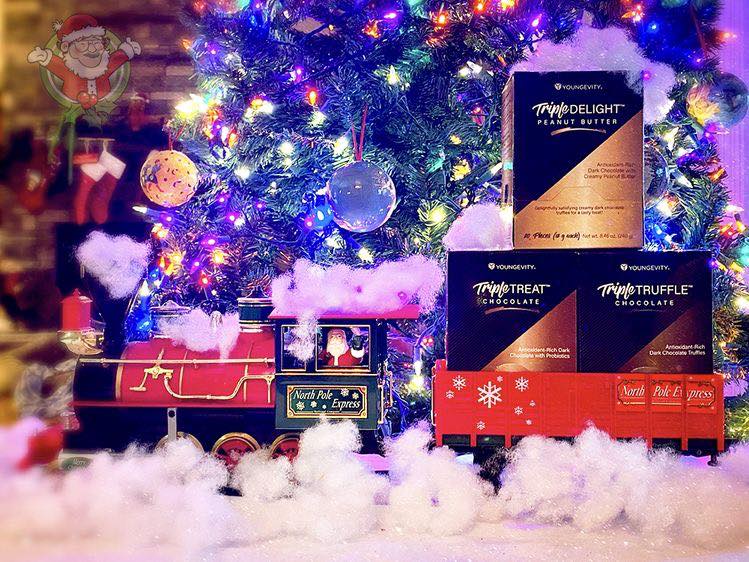
Triple Chocolate
Tasting the sweet success of a delectable redesign.
Branding • Campaign • Packaging • Social
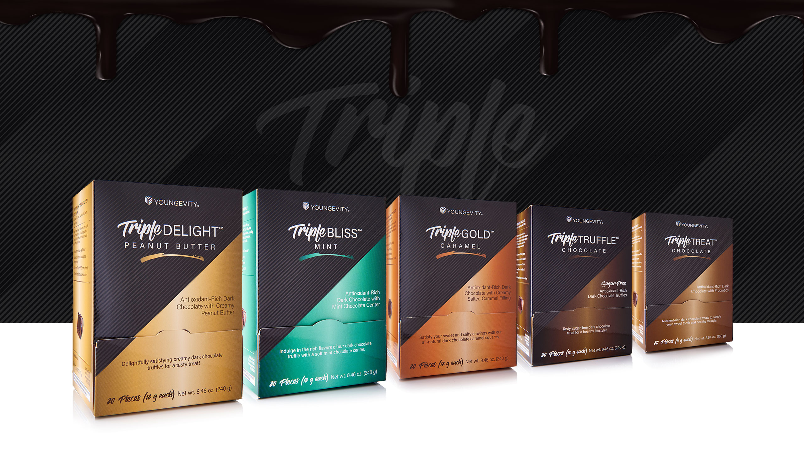
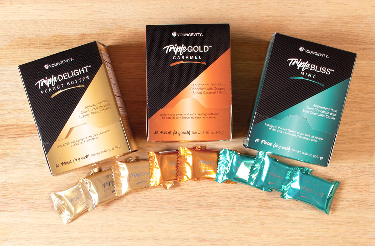
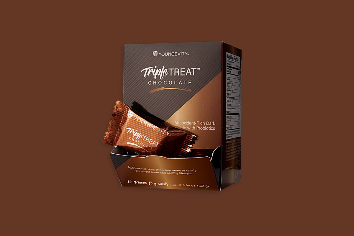
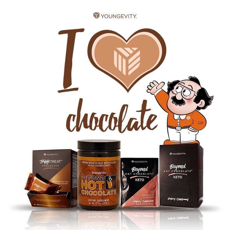
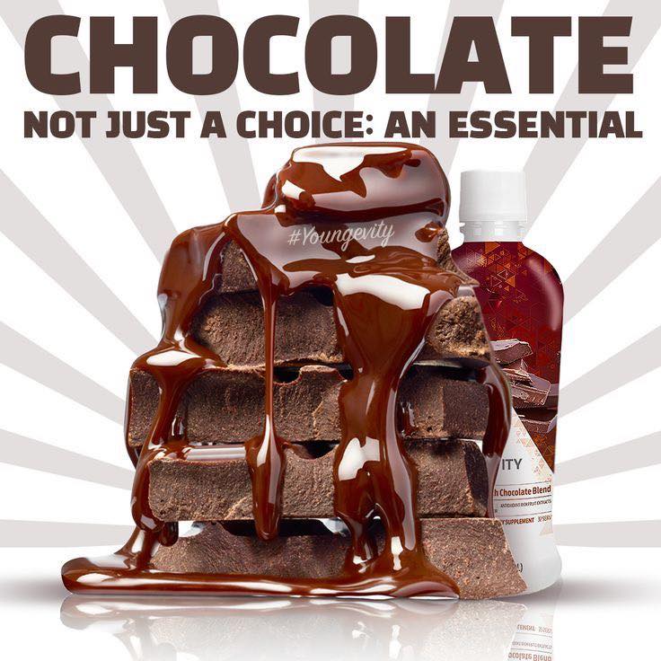
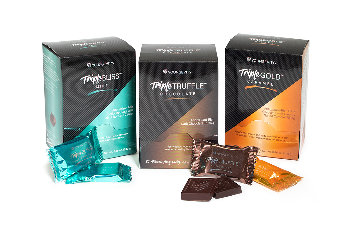
Triple Chocolate is a collection of premium chocolates that are antioxidant-rich and full of nutrients. Crafted with the highest-quality ingredients, these delectable treats offer unparalleled taste while being beneficial to your health. The products underwent a complete rebranding and were reintroduced with a fresh new look.
LEVEL
Corporate
PROJECT
Product line rebrand & relaunch
ROLE
Creative Director / Art Director
– As part of the in-house marketing team at Youngevity, a health products and services company, I directed the rebranding, packaging and relaunch of the product line.
PROBLEM → SOLUTION → APPROACH → RESULT
THE PROBLEM
Although the chocolates were still somewhat popular among loyal customers, their overall sales had become relatively flat over the years. The intense seasonal buzz they used to create, was no longer happening.
This was a real problem because they are a limited-time launch every year, during cold weather only, for specific temperature-related reasons. This means the company has to pre-order all the product and its packaging components far in advance of the selling season.
Once the season is over, these products can’t be warehoused the same as the thousands of other company products, due to the nutrients that are included. During the most recent “chocolate season” the product didn’t sell through, and the company literally had to eat their losses (the unsold boxes were put out for employees to enjoy).
THE SOLUTION
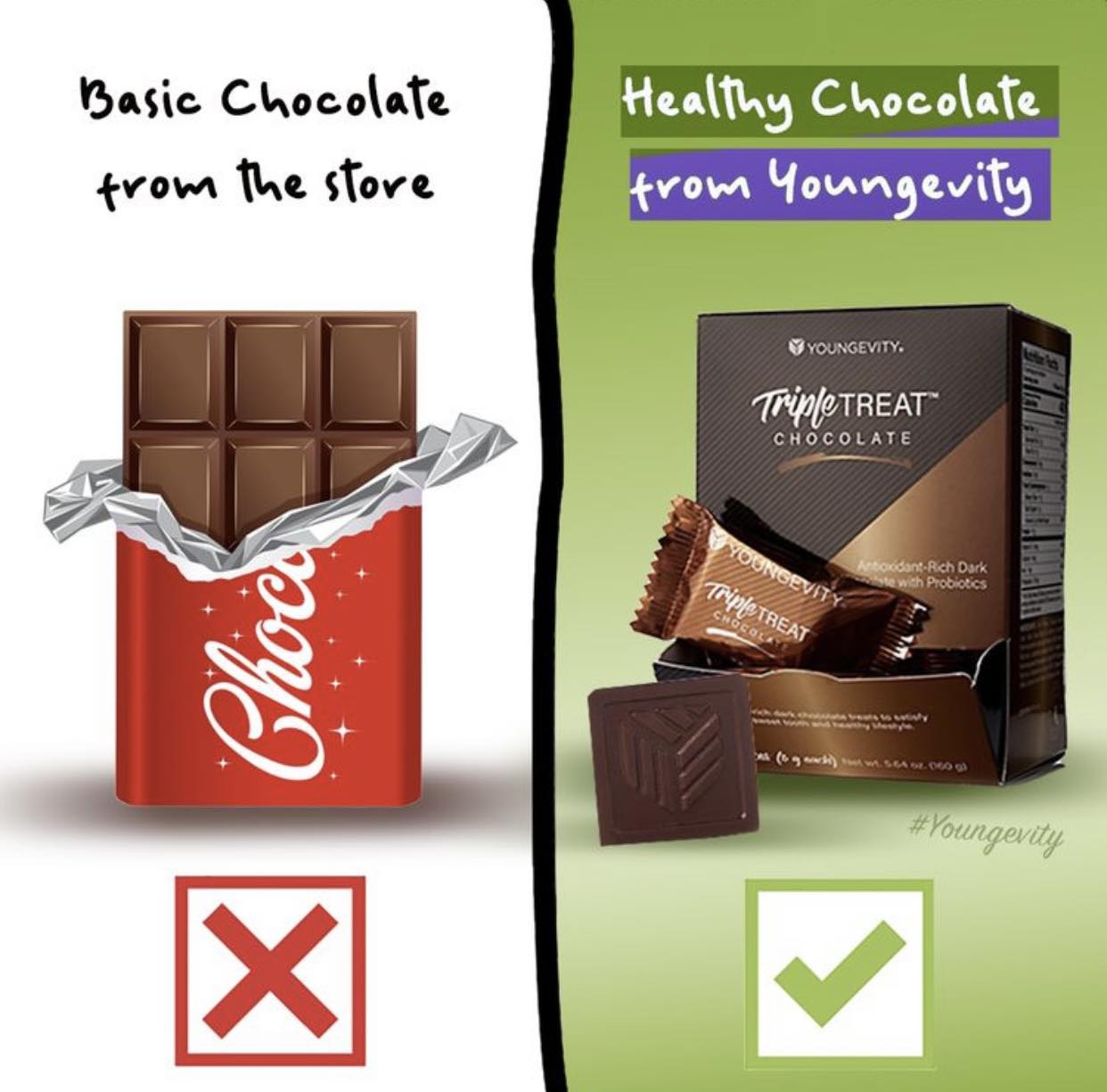
Our solution was to rebrand and promote. The chocolate line had looked the same for several years, and nobody wants to pair the thought of “old” with chocolate or any food for that matter.
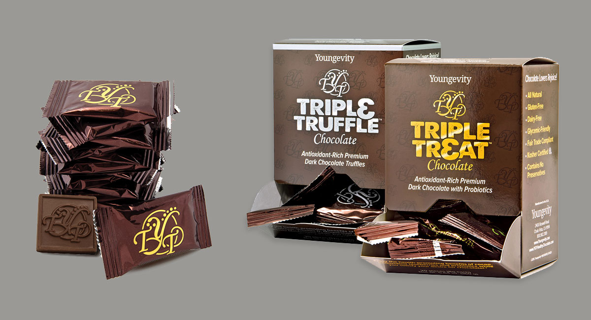
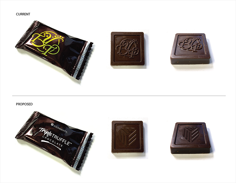
Old packaging
The idea was that with a new look, it would give us a reason to relaunch the line. A way for us to reinvigorate the masses and get them talking about chocolate again.
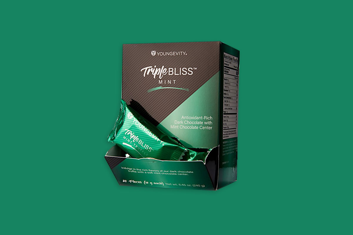
The packaging needed to portray the premium, high-end chocolates the brand represents. Moving swiftly through our usual process, we gave the products a complete overhaul – except the formula. Taste wasn’t the issue, as confirmed by social media polls, but everything else right down to the actual chocolates themselves.


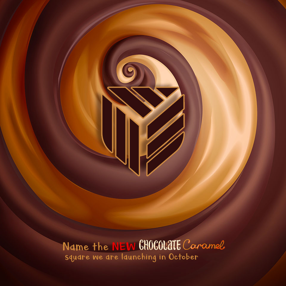
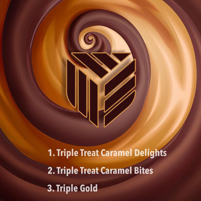
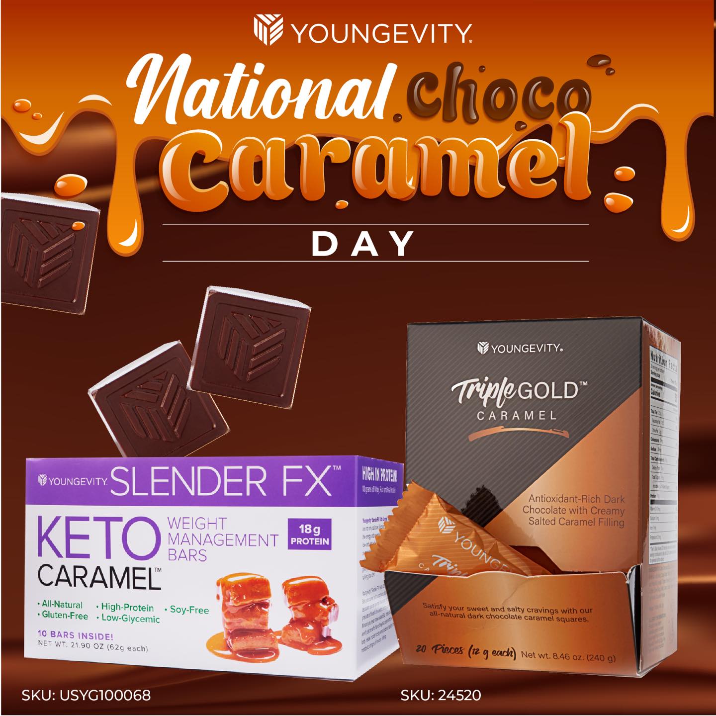
We piqued user interest with a naming contest on social media, for the new caramel chocolate that was being launched with the line.
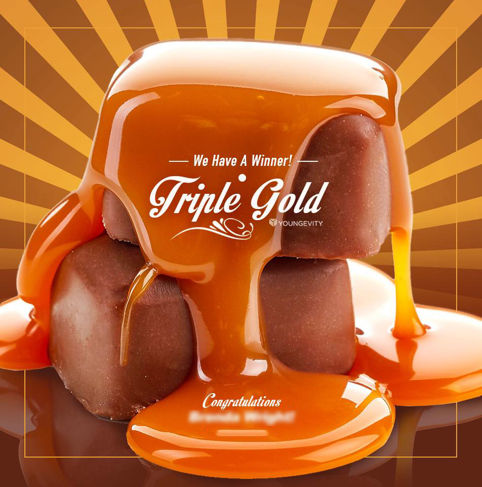
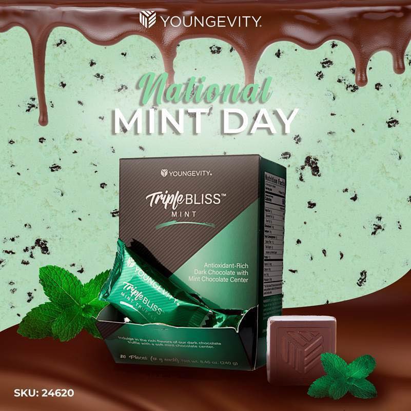
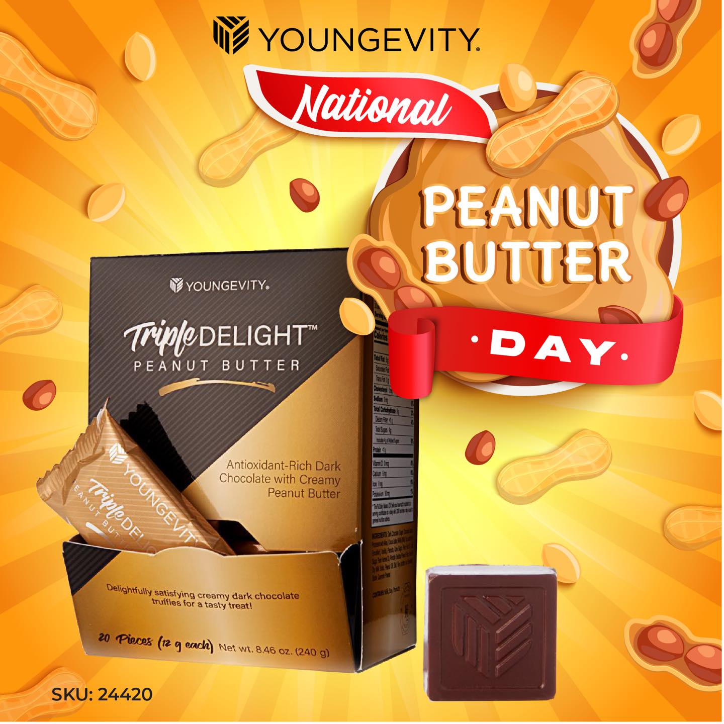
With the new look in place, various other social media campaigns and cross-promotions came easily. There was no lack of content – its a fun topic that people love.


THE APPROACH
It was already late January and the new chocolate season begins in October. Needless to say, we were working within a very limited time frame.

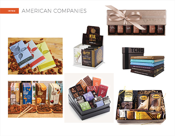
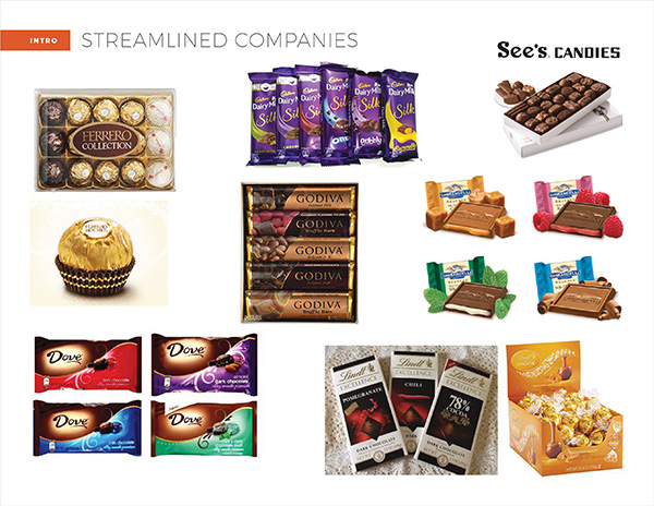
Rebranding was no small feat, as there’s obviously great competition in the world of chocolate. A lot of time was spent analyzing the current brands and companies in the traditional, as well as healthy, chocolate realms.

Luckily, we knew we had our loyal chocolate customers out there, waiting to jump back in – they just needed something to be excited about again.
We started with the logo. It needed to be modern, elegant and work with all the different product and flavor names. Multiple different options were designed, to make sure we found a good fit for the line.
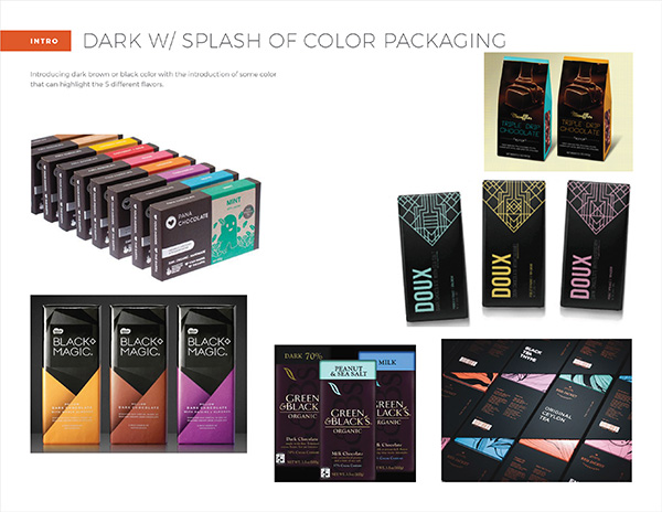
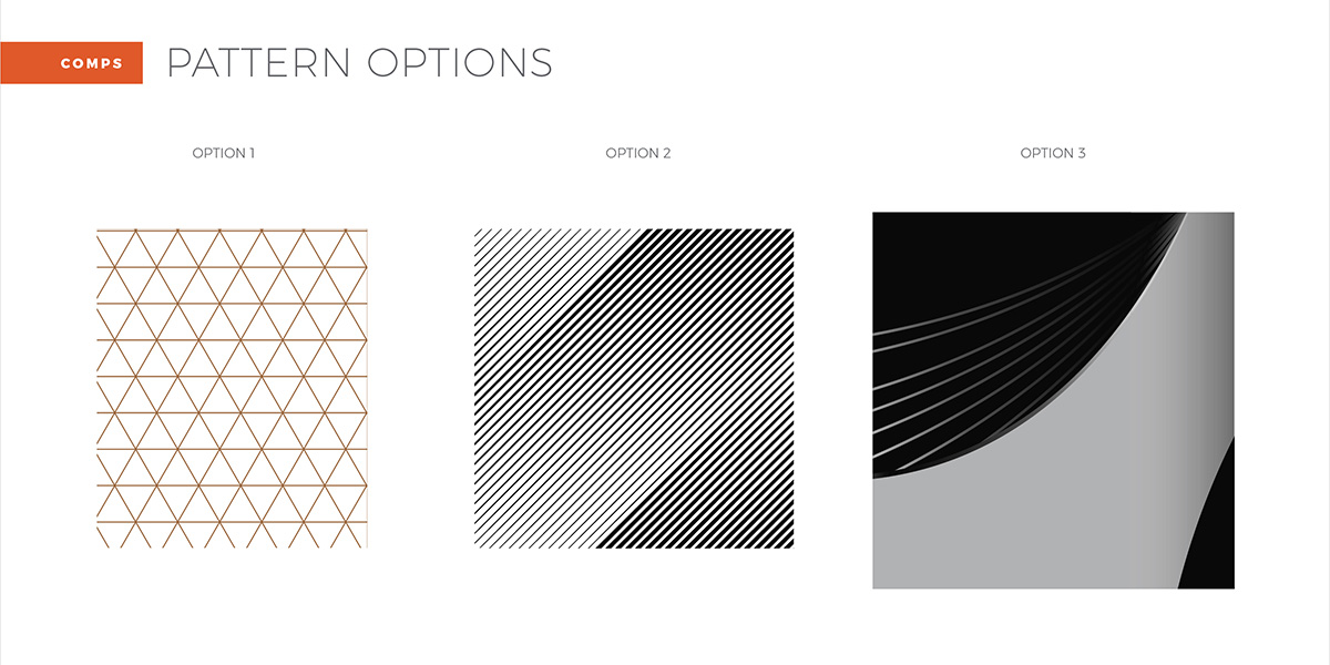
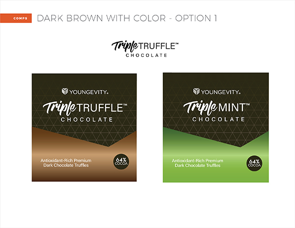
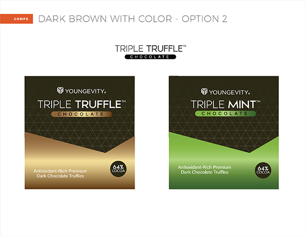
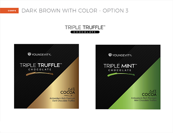
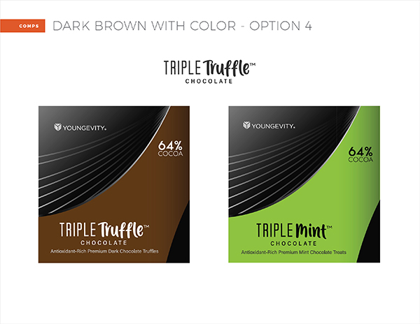
In reviewing packaging design options, I loved the contrast of a very dark base color with bright accent colors for the boxes. Knowing there would be dark areas included, we explored pattern designs to add an interesting touch.
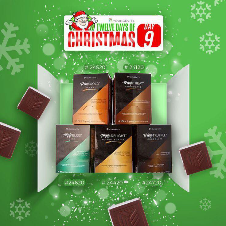
New colors for all the different flavors were carefully selected for the box packaging and foil wrappers. We had to be careful the palette stayed far enough from a different chocolate product in one of our other lines.
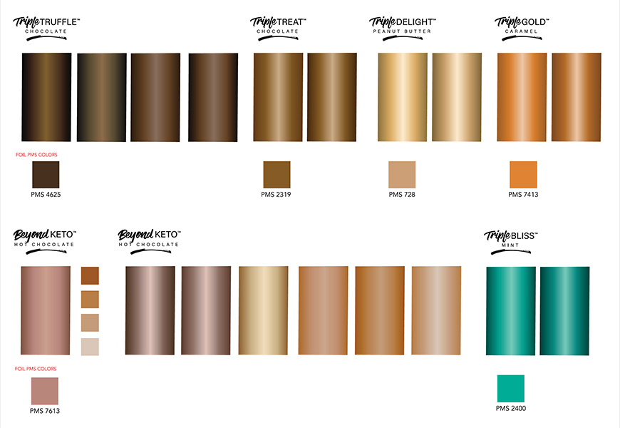
There was a dizzying array of options and each print color had to be cross-matched with its foil equivalent, but we eventually narrowed it down to the finals.

Countless drafts and variations of the box packaging were designed in order to find just the right look. Ultimately they were aligned with concepts from the brand guide, using the signature sharp angles that were now a backbone of the company design elements.
The creation of the new chocolate mold was an interesting process that nobody on the team had previous experience with. So we produced a faux 3D mockup to give management an idea of what the new chocolates would look like compared to the current mold.
At one point very late in the process, due to a manufacturer issue, a new flavor (almond chocolate) that would have launched with the rebrand, had to be cancelled. It was unfortunate as it would have been a welcomed bright blue color in the lineup, and a great promotion opportunity.
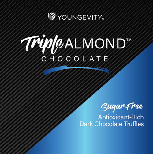
It was also too late to repurpose the color to one of the other products, as each of the other foils had been pre-arranged with printer. Luckily they hadn’t secured the new color just yet, so there were no cost issues, although it made us wonder what would’ve happened if we had needed it.
THE RESULT
After a rebranding blitz to the finish line, we “wrapped up” our shiny, new chocolates just as the season approached. To our delight, they launched with great customer fanfare that continued on well past the season. Chocolate was back!
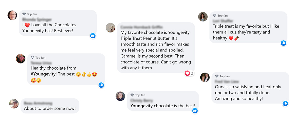
It was truly a sweet success. Record-breaking presales and corporate event sales, followed by regular online sales, and the entire seasonal inventory easily sold though.
The products are still currently available during the “chocolate season” in the fall.
Note: Detailed sales statistics are withheld to comply with non-disclosure agreements.
FINAL THOUGHTS
Despite the fast pace we had to work at, this was a pretty fun project. All the bright colored foils were always around, and people couldn’t help playing with them. They were a nice, mindless distraction when needed. Plus, we “had to” taste test all of the chocolates many times, to make sure we were familiar with the flavors. But it was, of course, just for marketing and branding reasons 😉
THE TEAM
CREATIVE DIRECTOR
Sean Walker
ART DIRECTORS
Sean Walker, Carey Gansert
DESIGNERS
Carey Gansert, Maile Soon
PHOTOGRAPHER
Jason Guffy
SOCIAL MEDIA
Paola Martinez
COPYWRITER
Rocio Ramos
PROJECT MANAGER
Ethan Shurson