Rebound FX
Bouncing a brand back in the energy drink game.
Branding • Packaging
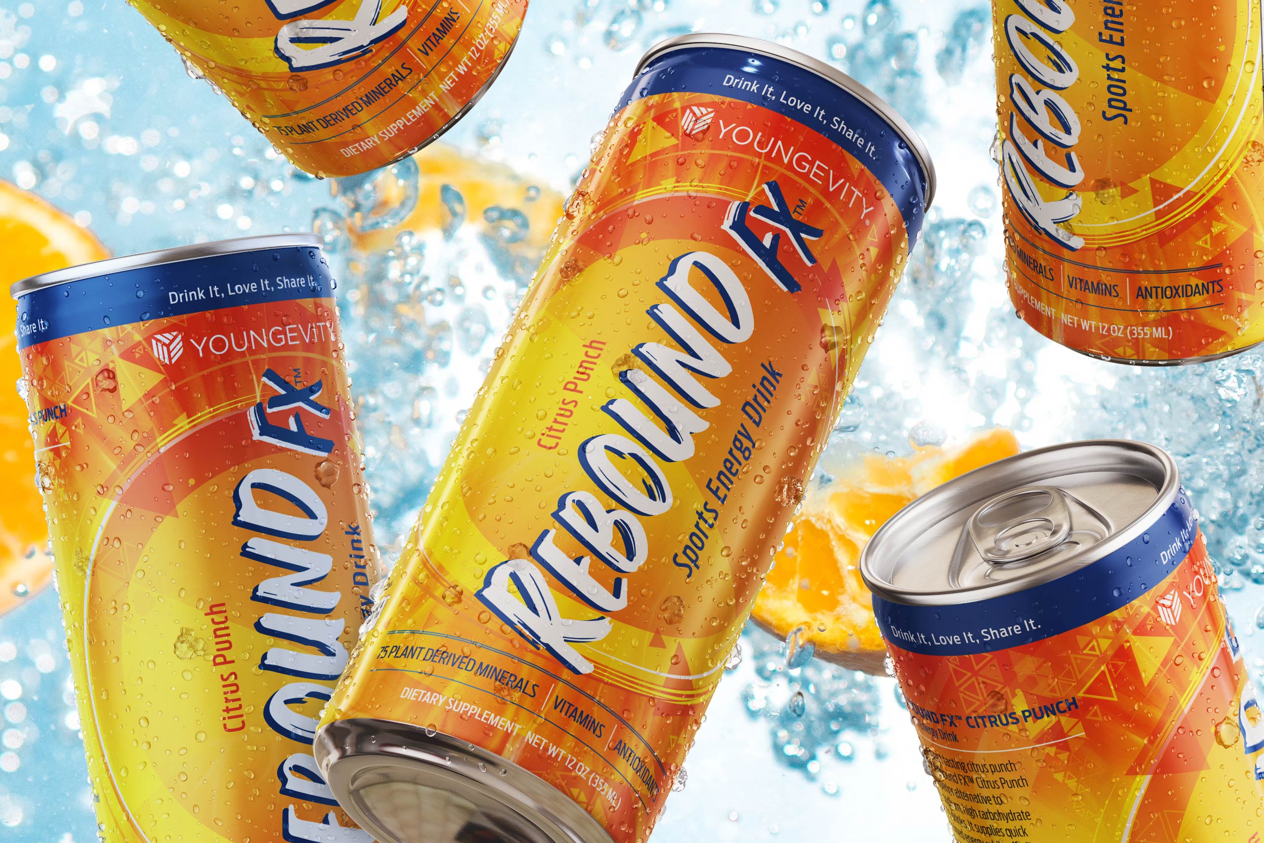
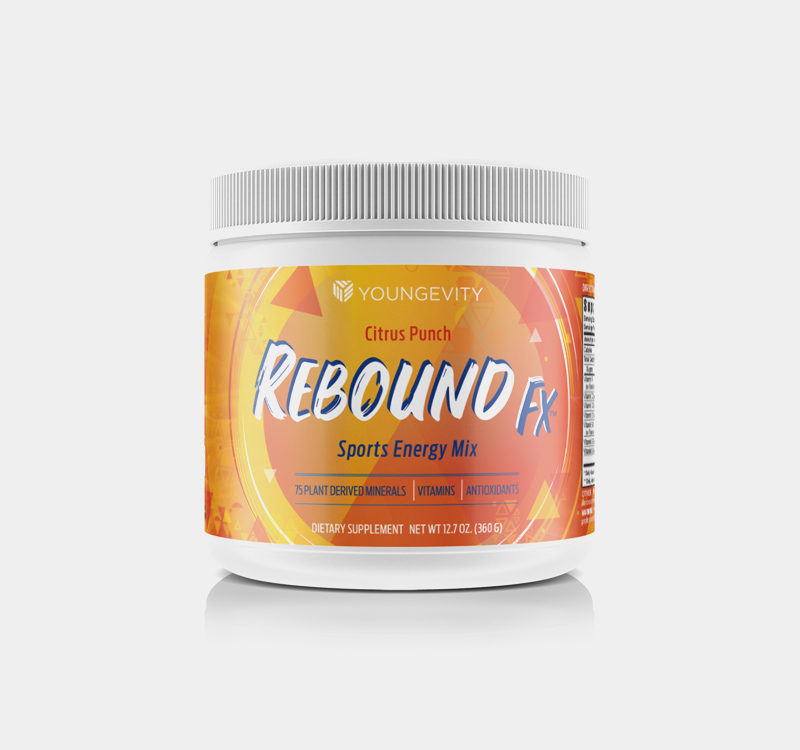
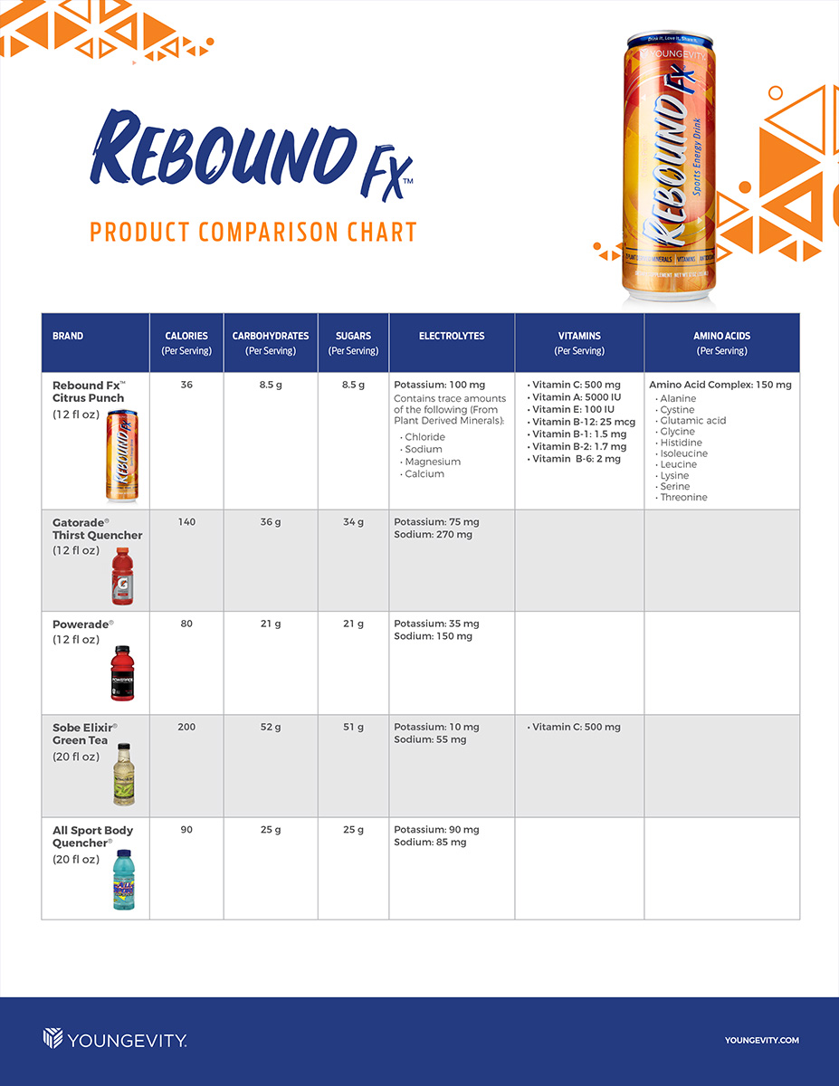
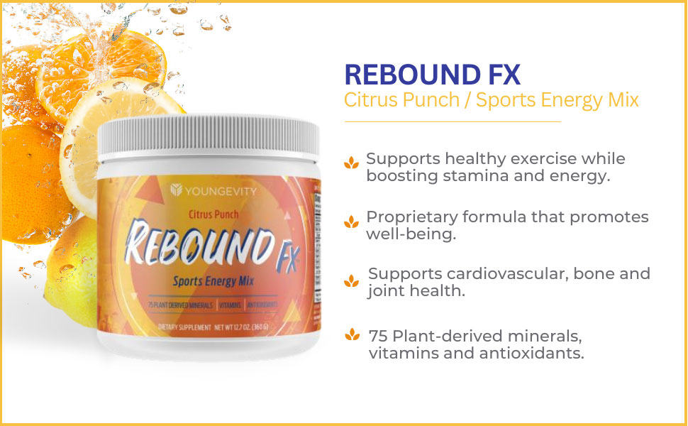
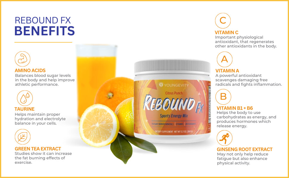
Rebound FX is a superior alternative to high-sodium, high-carbohydrate sports/energy drinks. Packing a great-tasting citrus punch flavor, it supplies quick, sustained energy, while offering a balance of antioxidants, natural herbs and minerals that must be replenished after a hard workout.
This rare combination of energy and recovery is based on a proprietary amino acid complex formula that surprisingly contains no artificial ingredients and far less sugar than the leading sports/energy drinks.
Our challenge was to refresh the branding with a modern look while maintaining a familiar feel to the popular product among current customers.
LEVEL
Corporate
PROJECT
Product rebrand
ROLE
Creative Director / Art Director
– As part of the in-house marketing team at Youngevity, a health products and services company, I directed the rebranding and packaging of the product.
The new concept was to position the brand around the energy and recovery benefits that Rebound FX provides, rather than the sport its name references.
This was done in order to better universalize the product’s usage for any intense activity, to avoid the customer directly associating it with only basketball.
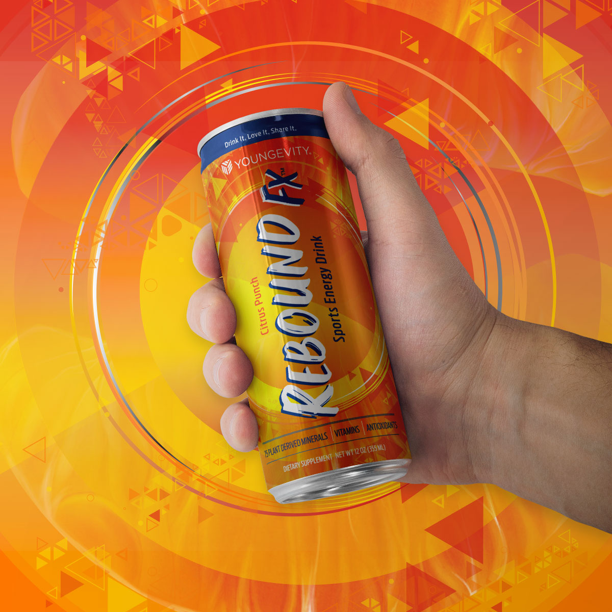
A new logo, patterns and graphic elements were designed to convey motion and inject a powerful, in-your-face style into the branding. Key nutrients were called out front and center to showcase the additional recovery benefits gained.
To maintain familiarity, similar colors were used as a starting point for a more vibrant palette that would further the idea of movement.
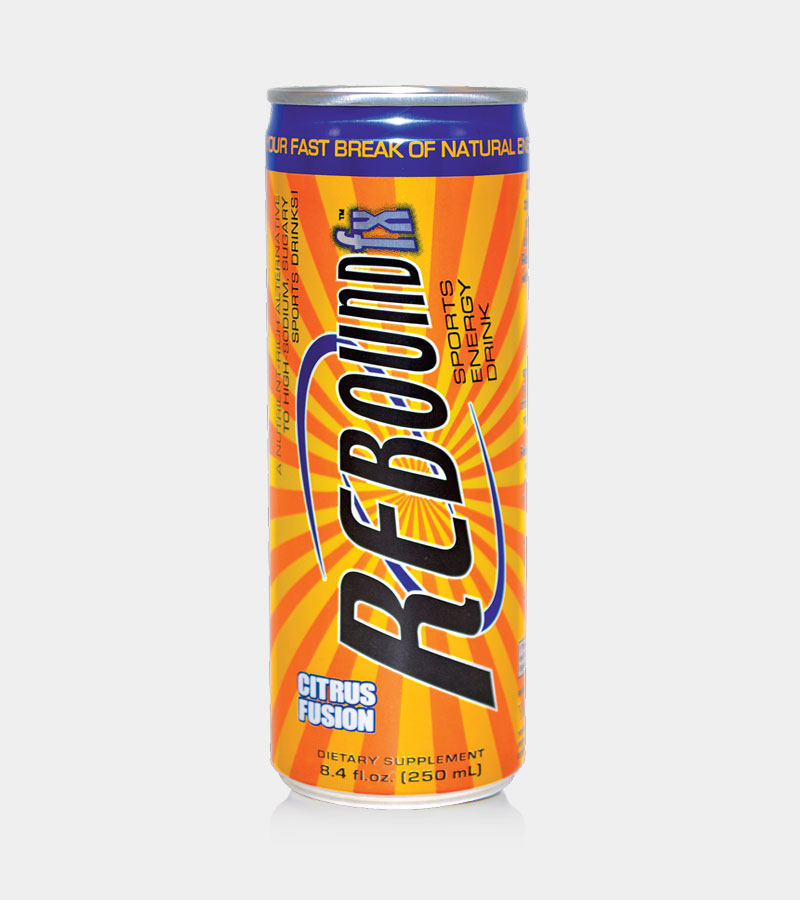
BEFORE
AFTER

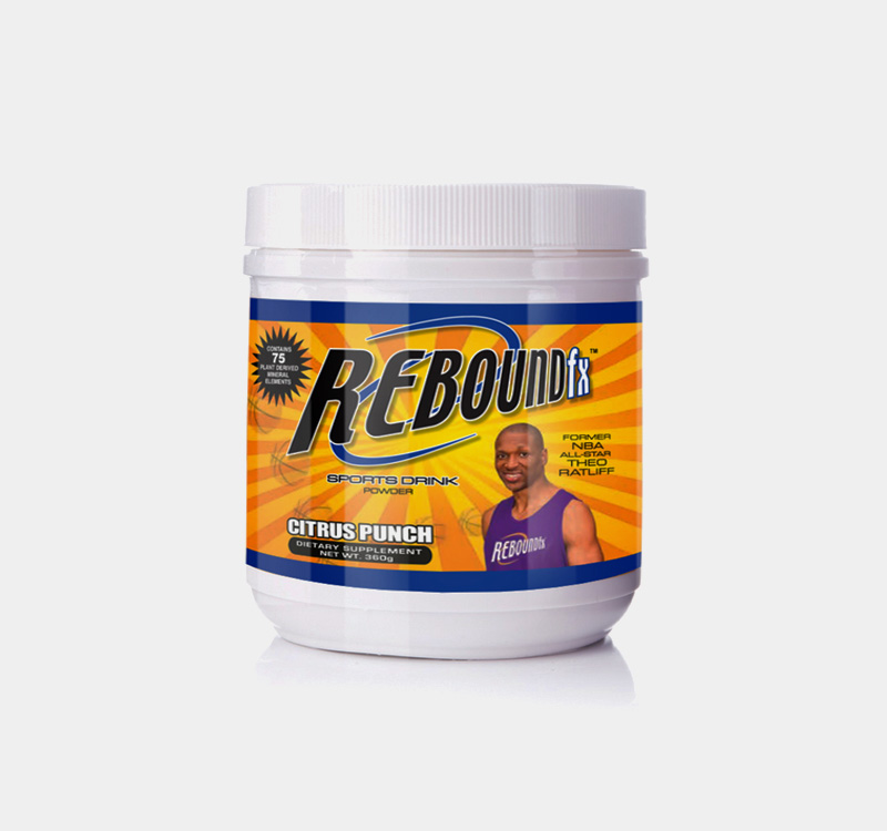
The new branding was also applied to the powdered version of the product, drastically updating its look as well.
BEFORE
AFTER
Product Education
Logo Concepts
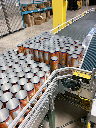
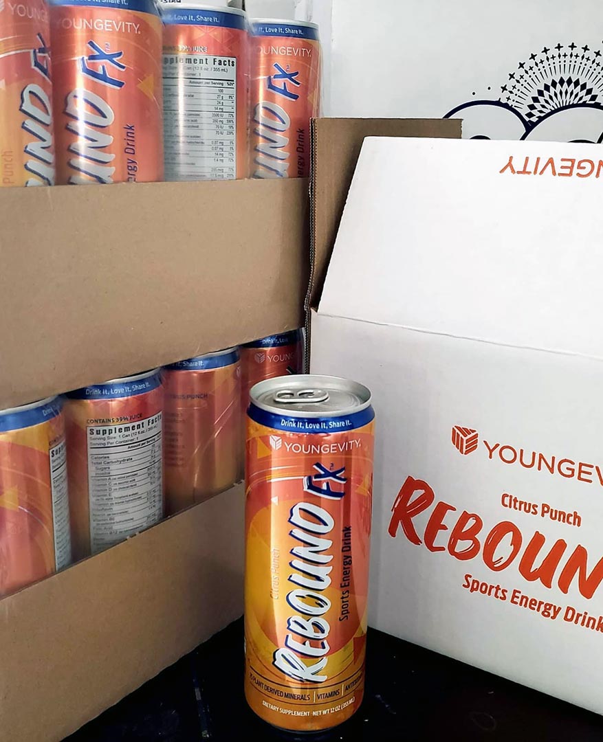
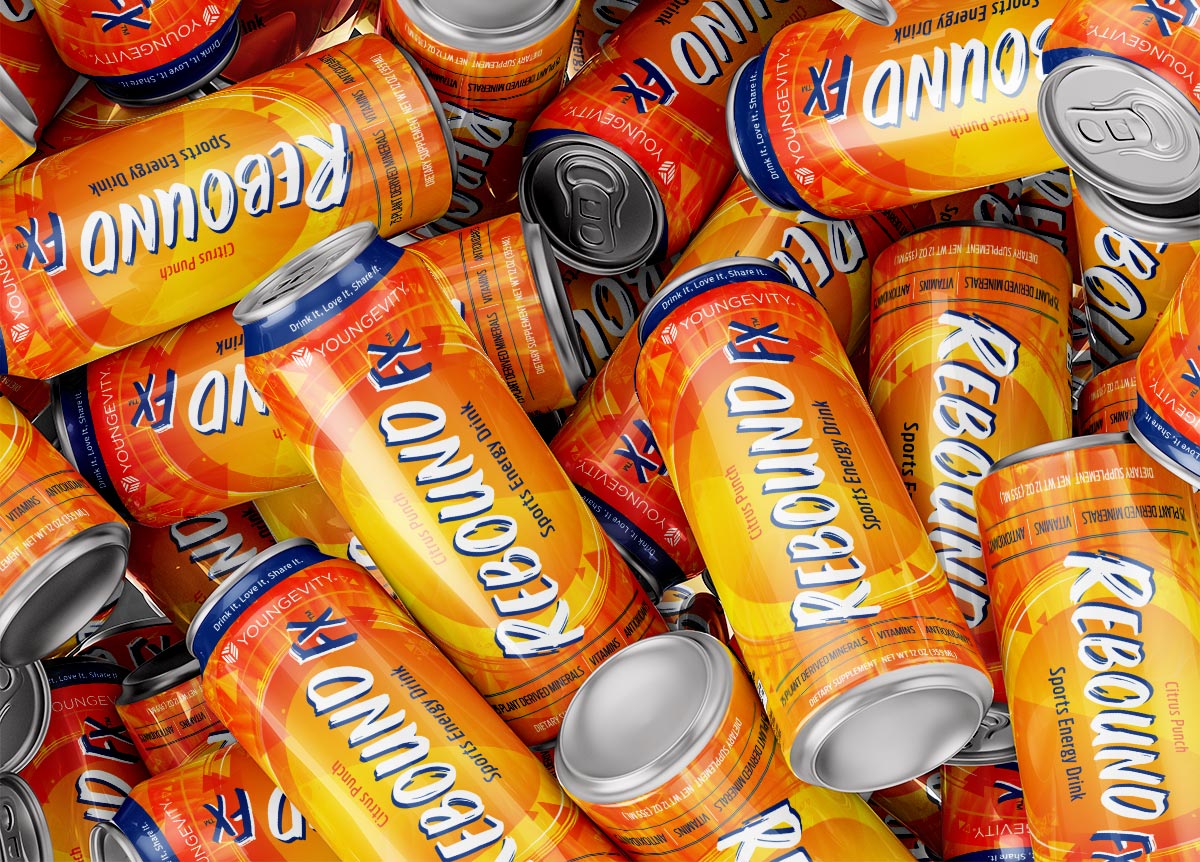
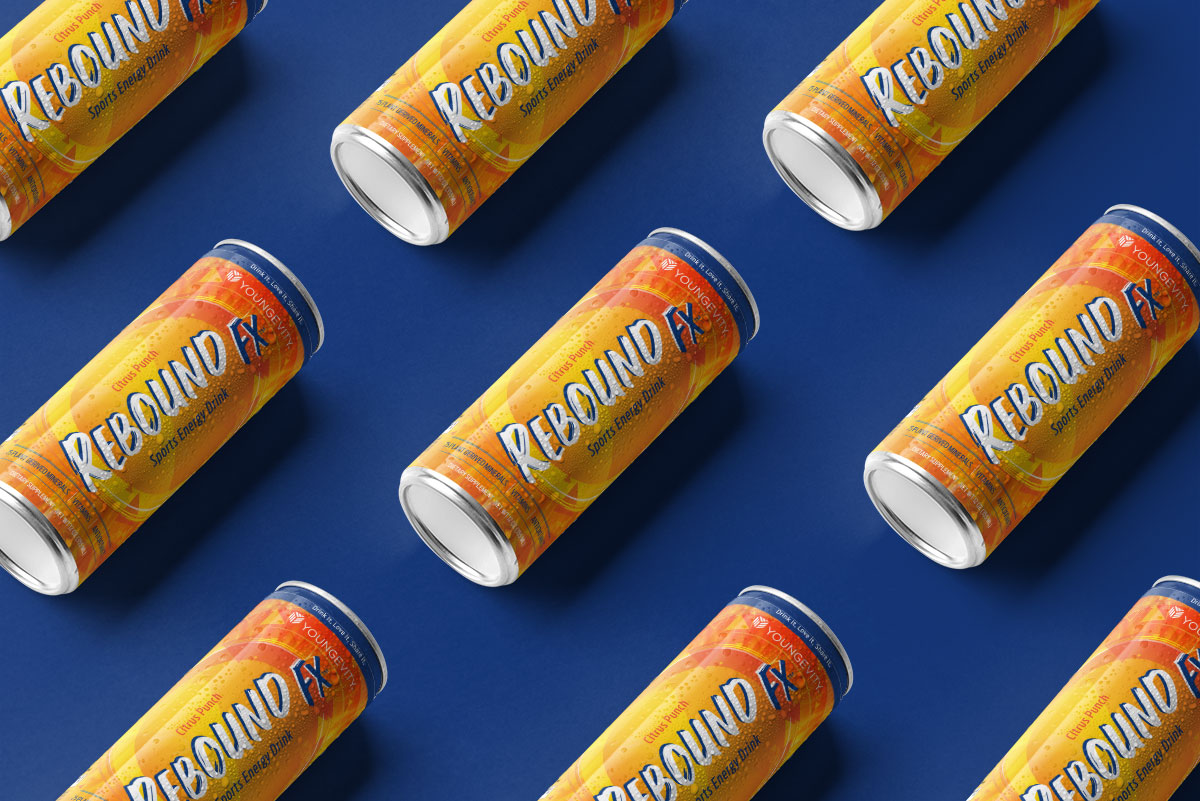
Can production / Final packaged product